Logo Design in Gurgaon for Strong Brand Identity
Logo Design in Gurgaon is one of the most important elements of creating a successful and recognizable brand. A professionally designed logo acts as the face of your business and helps customers identify and remember your brand. It creates a strong first impression, builds credibility, and communicates your company’s values in a simple visual form. At Gurgaon Graphics, we specialize in creating custom logo designs that reflect your brand identity and support your business objectives.
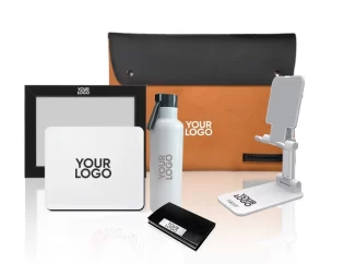
A well-designed logo should be simple, unique, memorable, and versatile. It needs to look professional across different platforms and marketing materials, including business cards, websites, brochures, packaging, social media profiles, and promotional products. A strong logo helps maintain consistency in branding and makes your business stand out from competitors in the market.
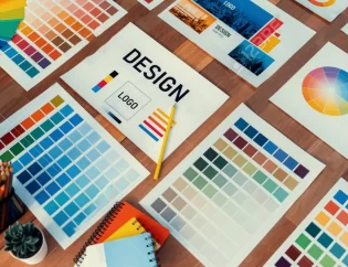
Our logo design process begins with understanding your business, industry, target audience, and brand personality. We take the time to learn about your goals and vision before developing creative logo concepts that align with your brand message. By combining creativity, strategy, and modern design principles, we create logos that are visually appealing and meaningful.Furthermore, a consistent logo strengthens brand identity.
Whether you are launching a new startup, expanding your business, or rebranding an existing company, our Logo Design in Gurgaon services are designed to help you establish a strong visual identity. Moreover, a professional logo helps improve brand recognition but also builds trust and confidence among potential customers. It serves as the foundation of your overall branding strategy and plays a key role in long-term business growth.
Custom Logo Design Services by Gurgaon Graphics
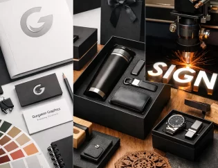
At Gurgaon Graphics, we are committed to delivering high-quality logo designs that leave a lasting impression. Our goal is to create a logo that represents your business effectively and helps you connect with your audience. With a custom-designed logo, your brand can achieve greater visibility, stronger customer engagement, and a professional image that supports future success.
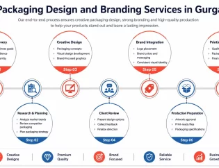
Explore our Graphic Design Services, Packaging Design and Branding Services for complete business branding solutions.