Our
Work
We design category defining products and experiences, for start-ups, blue-chip internationals and some of the best loved brands in the world. Our services include industrial design, packaging design, foresight and strategy, concept visions, visualisation and prototyping.
We are Matter. Difference, made.
THE NEW
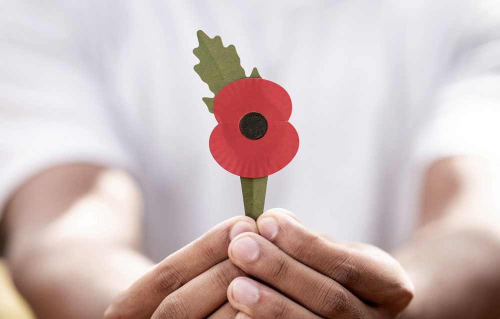
PAPER POPPY
PAPER POPPY

A DIFFERENT
LEAGUE
LEAGUE

Lasting
impressions
impressions
PROTOTYPES
FOR THE
FUTURE
FOR THE
FUTURE
A NEW ERA OF
DIAGNOSTICS
DIAGNOSTICS
Indomitable
Spirit
Spirit
Engaging more
women in HPV
screening
women in HPV
screening

Outselling
an icon
an icon
Natural
Beauty
Beauty

50L
HOME
HOME

CANVAS
FOR
CREATIVITY
FOR
CREATIVITY
Food
Futures
Futures
Universal
Colourful
Fun
Colourful
Fun
DO MORE WITH
LESS WATER
LESS WATER
We are proud to be
working with:


Work with us
If you are interested in working with us, or would like some more information, we’d love to hear from you.
Join our team
We are always on the look out for talented and ambitious designers. Whether your looking for an internship or full time role and have the creative instinct, design thinking and passion to make a difference, we want to hear from you.
Studio space
We have desk space available for like minded creatives in the south west. If you would like to share our studio, please get touch.
Event space
We have an impressive event space on the ground floor of our studio in the centre of Bath. If you are looking to host something amazing, please get in touch.
Matt Wright
Creative Director & Founder
New business and creative lead with infectious ambition, creativity and a meticulous eye that keeps the team honest to its beliefs and the business punching above its weight.
21 years in front end innovation, product design and manufacture, including Dyson NPI and Pentagram.
15 years sourcing the very best creative team at Matter.
Project and strategic lead and a master at navigating teams through tough design challenges, with original design approaches, intuitive strategy and distinctive creative direction.
12 insightful years of design consultancy experience across a breadth of consumer categories, with significant expertise in FMCG and a healthy ambition for sustainable innovation.
8 years leading University partnerships.
Project and foresight lead with an unrivalled affinity for understanding people, bringing insights and informed creativity to briefs and approaches and bringing out the best creative from the team.
12 years accomplished industrial designer directing creative and strategic projects for leading FMCG and sports hardware brands, both in-house and consultancy, across a breadth of consumer categories.
Jonathan Sturgess
Senior Maker Lead
Lead Maker and workshop manager, with a principle background in architecture, automotive and product design. Specialist in CAD surfacing, rapid prototyping and traditional hand making.
13 years in industry, leading the modelmaking and prototyping outputs of firms including Heatherwick Studio and Dyson.
10 years as an associate lecturer on various degree programs at the University of Bath and Bath School of Art and Design.
Duncan Colquhoun
Senior Creative Lead
Lead designer and team lead with inspired, creative breadth, a hands on approach to bringing ideas to life and an insane eye for detail.
8 years consultancy experience, with particular expertise in FMCG, structural pack and premium brand.
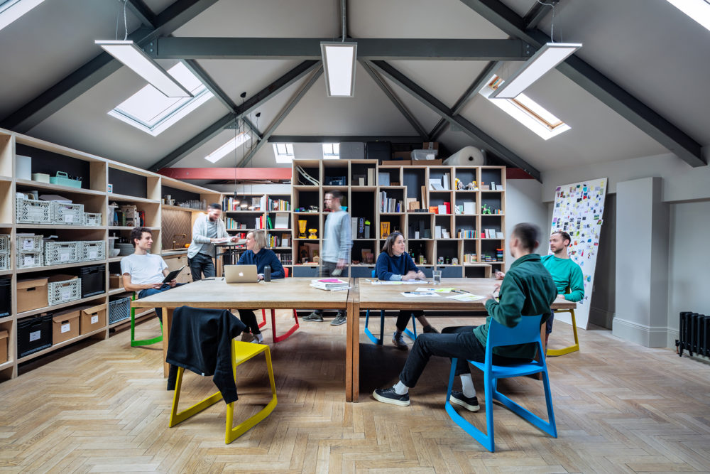
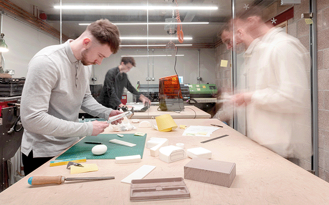
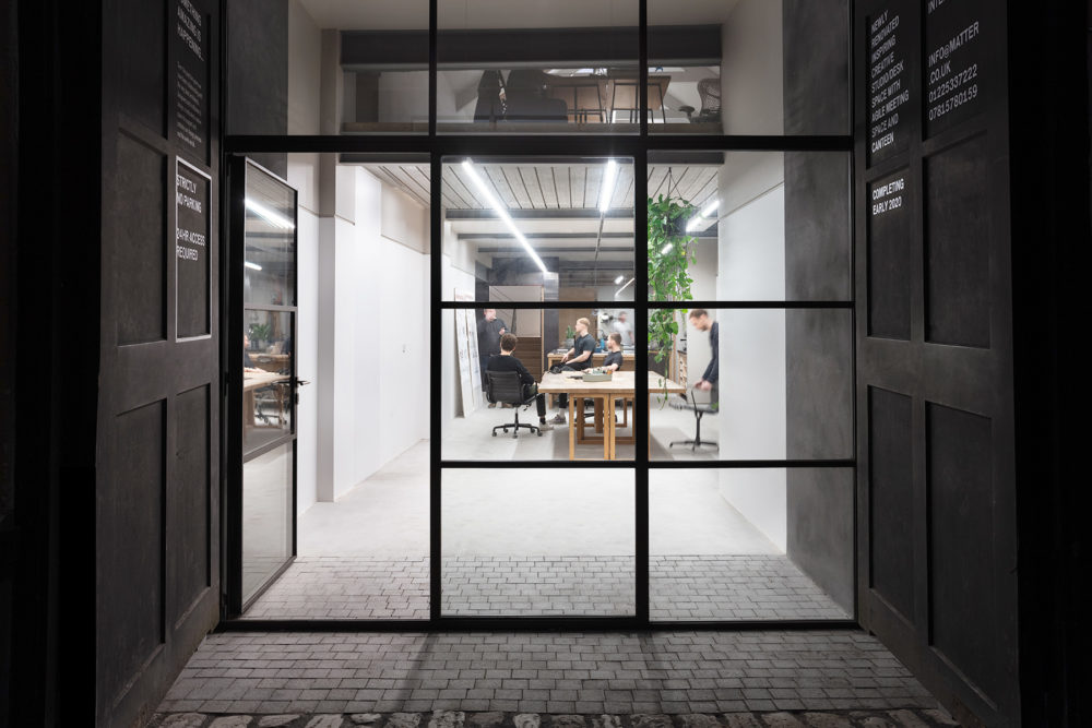
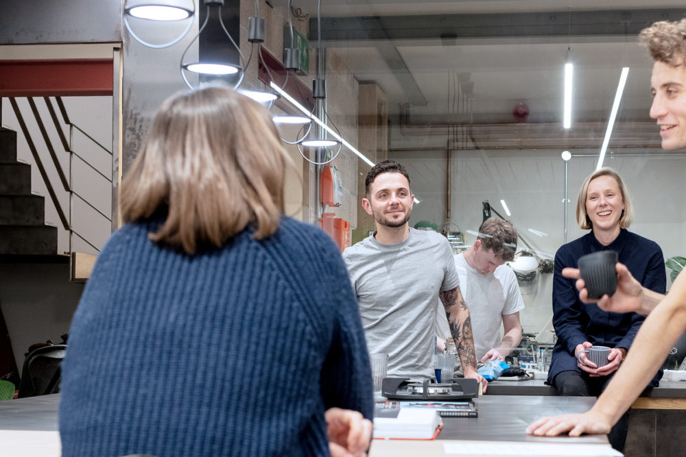
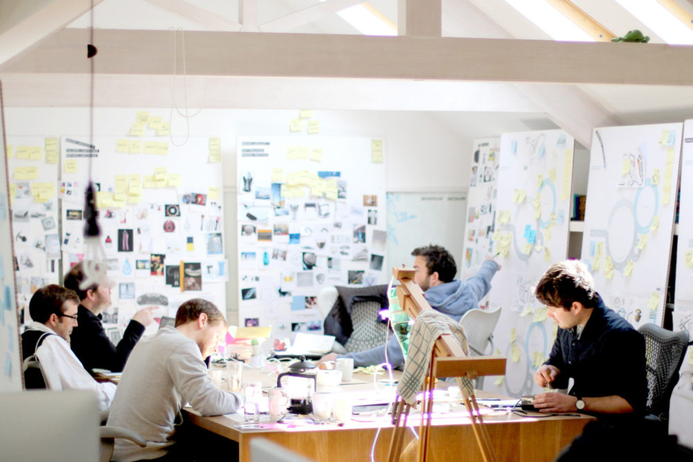
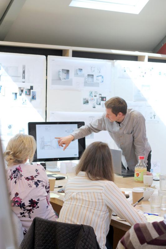
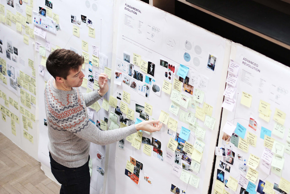
Our
Studio
We are designers, committed to making a difference. A creative studio of ambitious thinkers and makers, inspired by what we can achieve for a positive future. For the people who experience our products, for our partners whose businesses we transform, for the world we live in.
We are Matter. Difference, made.
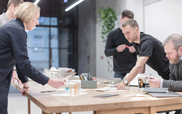
01
Design Space
An agile, creative space for thinking and making.
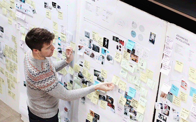
We take pride in exploring further and pushing our capabilities, in being well informed, responsible and always having an answer to ‘why?’
Creative to the core, yet structured and strategic in our approach. We always generate fresh and relevant ideas, efficiently captured as concepts to test and learn.
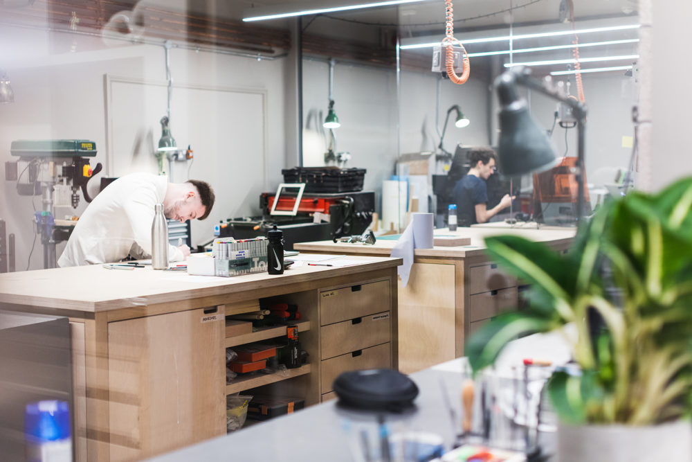
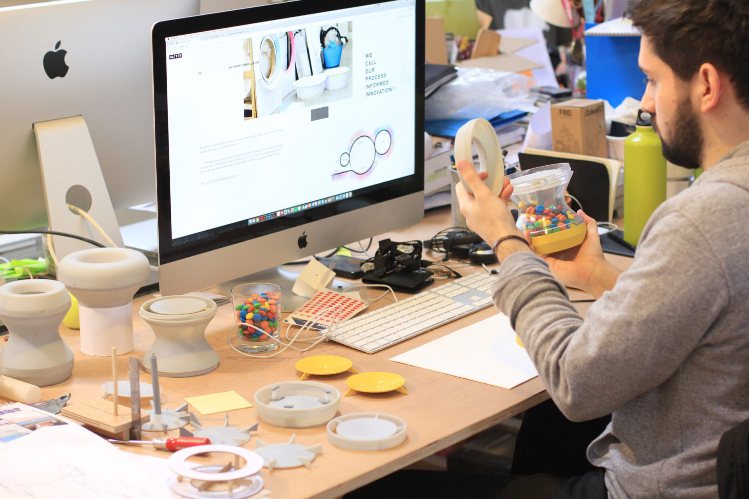
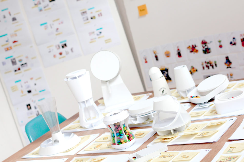
02
Workshop
A facility dedicated to bringing ideas to life.
A facility dedicated to bringing ideas to life.
We adopt a hands on process, to deliver tangible and meticulously iterated design, that will make a difference.
03
Creative Space
An open and collaborative space for workshops and events.
We’re here to be inspired and creatively inspire others, to challenge constructively and be brave with our provocation.
We’re here to be inspired and creatively inspire others, to challenge constructively and be brave with our provocation.
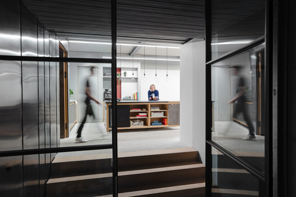
04
Kitchen
A place to eat, meet and welcome you in.
As a designer lead studio, we talk honestly, act openly and offer agility to react to developing needs. We are keen to talk to you about bespoke agreements and partnerships to ensure we can support you in your next venture.
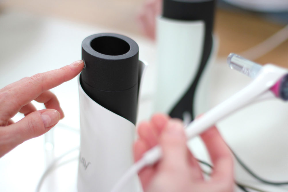
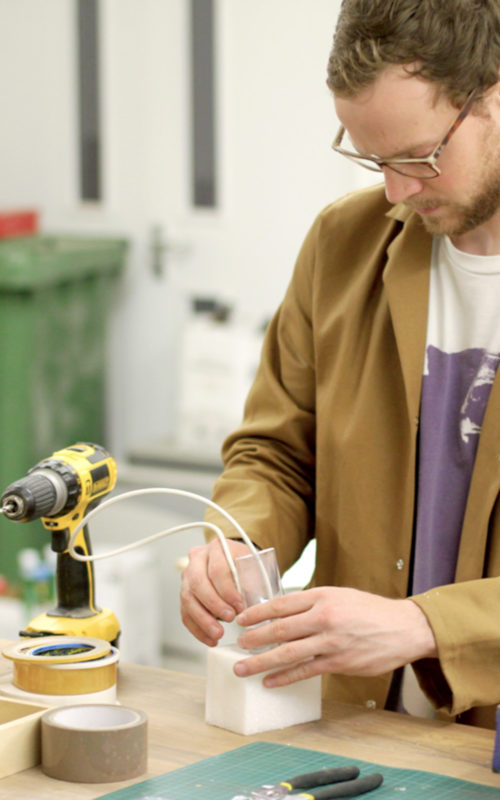
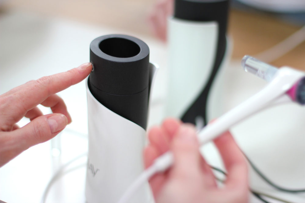
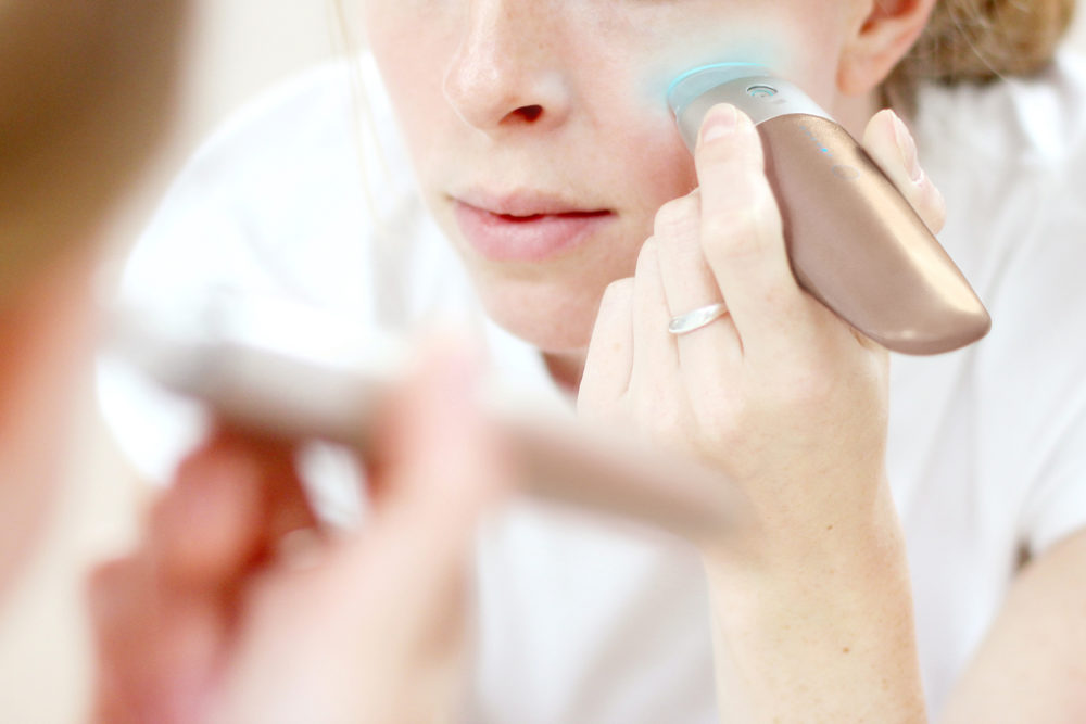
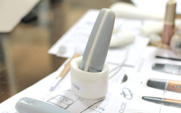
Natural
Beauty
A concept vision to inform the launch of a breakthrough beauty technology device.
A prototype can be as valuable as the product on the shelf that it informs.
In a 60 day design sprint we defined the market positioning, design language and product design, using iterative consumer testing of prototypes.
You can now buy the $599 Opté to photoshop your skin in real life.
digitaltrends.com, part of our continuing coverage of CES 2020

http://www.opteskin.care/
Brand
The Royal British Legion
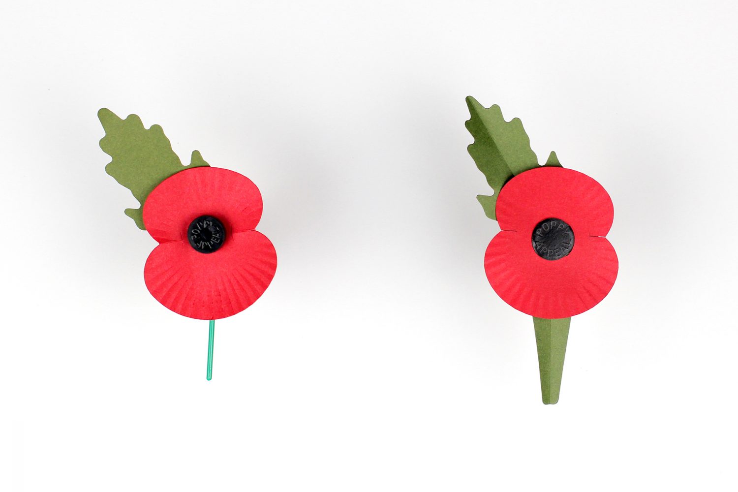
THE NEW
PAPER POPPY
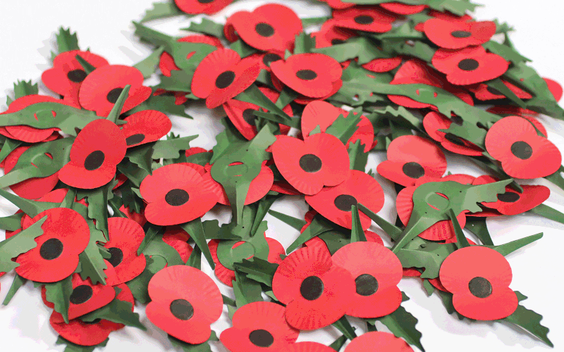
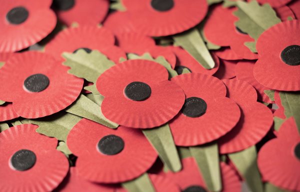
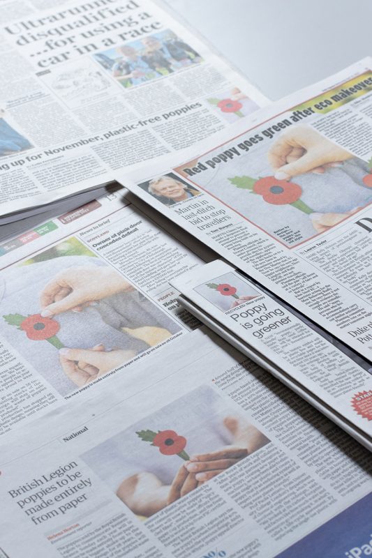
Redesign of the Royal British Legion’s iconic poppy to remove all plastic, making it 100 per cent paper and recyclable via ordinary paper collections.
Every October and November, the RBL and Poppyscotland give out millions of poppies across England, Wales, Northern Ireland and Scotland in return for a donation to the annual Poppy Appeal which provides support for serving and ex-serving personnel and their families.
The charities are committed to reducing single-use plastic in all activities, in a drive to be economical, sustainable, and to reduce their impact on the environment. The iconic poppy asset has been a key focus in this ambition.
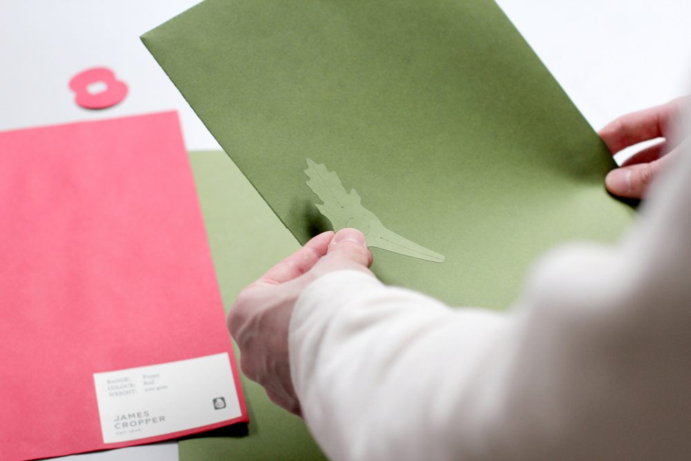
In collaboration with specialist paper manufacture and long-term supplier of the Legion, James Cropper, we proposed an all-paper solution. The concept was selected for production development and eventually approved as our next generation poppy.
There were some significant complexities to overcome to achieve an all-paper poppy. Among these was the need for the poppy to be produced on a high-speed assembly line, without the use of adhesives. However, the technical challenges were never allowed to impact on the central ambition; to deliver a symbol of Remembrance that remains true to the iconic poppy.
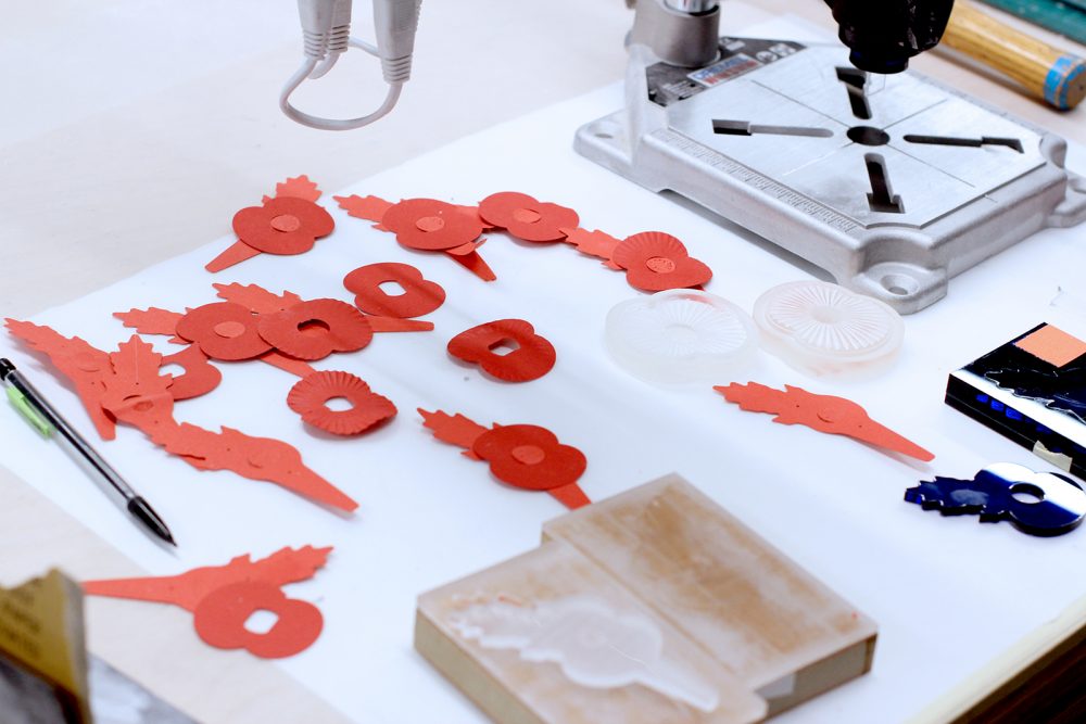
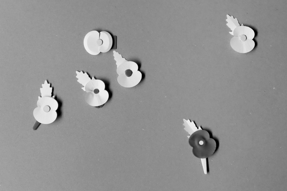
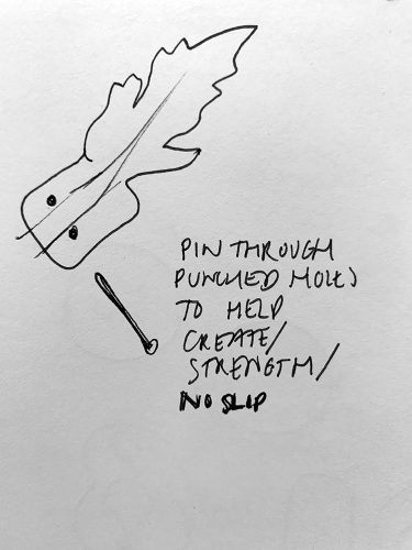
We explored hundreds of iterations during the design process, exploring form, finish and usability, while developing the innovative, automated assembly solution and testing the overall robustness.
In parallel, speciality paper manufacturer James Cropper developed two bespoke papers, Poppy Green and Poppy Red, which include 50 per cent recycled fibres reclaimed from the production of coffee cups.
“Every year since 1978, red and green papers made at our paper mill are transformed into millions of poppies for the annual Poppy Appeal that continues to provide vital support to the Armed Forces community.
“Although we are involved each year, we never take for granted what this symbol means to so many families and the country as a whole. Everyone at James Cropper is very proud of our long-standing involvement in the production of the paper poppy, worn the world over as a symbol of respect and remembrance.”
Steve Adams, Chief Executive Officer at James Cropper.
In answer to the Legion’s ambition to reduce single use plastic, the new poppy is 100% paper, fully recyclable and made using 50 per cent recycled fibres from the production of coffee cups and 50% renewable wood fibre. The production of the new poppy will reduce carbon emissions by 40% compared to the previous design.
The 100% recyclable poppy will be available for the 2023 Poppy Appeal alongside remaining stocks of the current poppy, which can be returned to Sainsbury’s stores for recycling.
Life Cycle Assessment by researchers from UCL’s Department of Chemical Engineering
“We’re proud to have designed a plastic-free poppy that will enable people to show their support for our Armed Forces community in a more sustainable way. We are thankful to Matter who created the innovative design for the plastic-free poppy. The agency has played a fundamental role in reducing the environmental impact of the new poppy, whilst maintaining the iconic poppy design that the public can wear with pride. The Royal British Legion provides a lifeline for serving personnel, veterans and their families facing hardship, injury and bereavement. We hope our new plastic-free poppy will encourage even more people to support the Poppy Appeal this year and help us continue its vital work.”
The Royal British Legion’s Executive Director of Marketing, Fundraising and Remembrance, Gary Ryan.
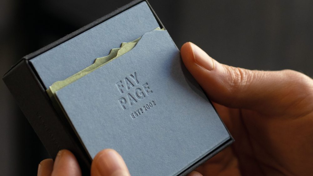
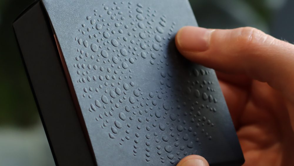
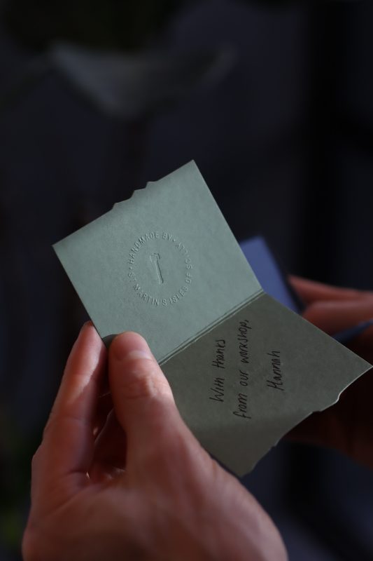
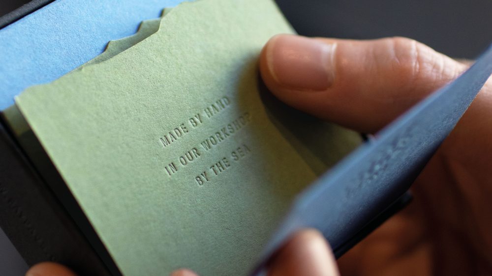
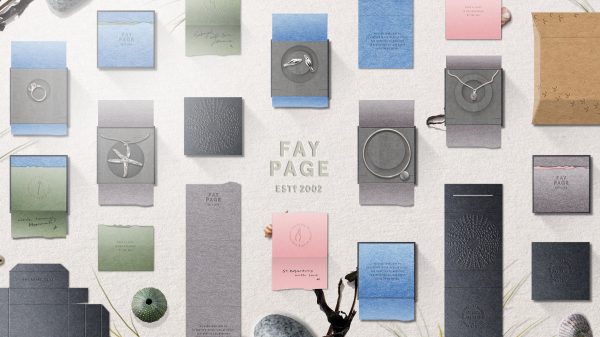
Lasting
impressions
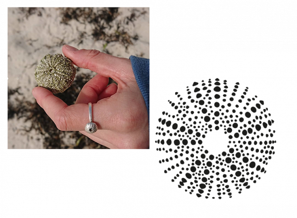
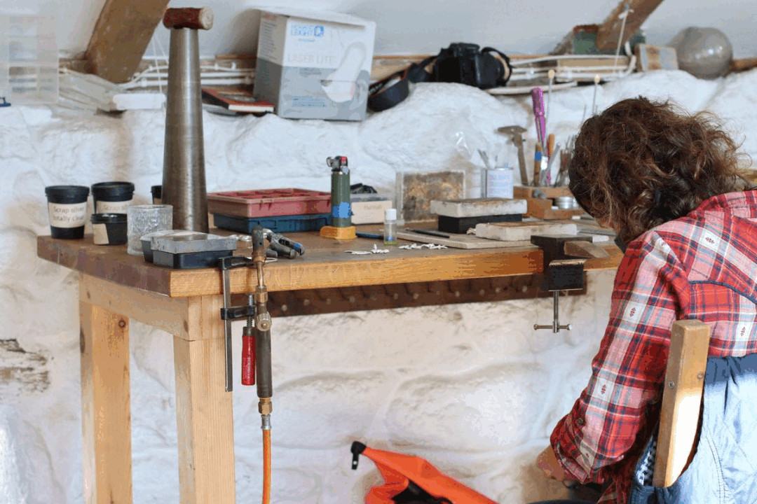
No plastic. No ink. No glue. A simple, sustainable, humble ‘matchbox’ that epitomises Fay and the makers of St. Martin’s.
Inspired by life on a tiny island and the strong sense of stewardship for their natural surroundings.
Fay Page are a collective of highly skilled jewellers based on the islands. People who visit Scilly love the idea that the islands are a well kept secret and Fay Page jewellery has become an embodiment of this.
Our brief was to capture the beautifully simple, sustainable lifestyle, evoking happy memories and a magical sense of place.
Blind emboss & debossed artwork adorn the surfaces of its clean construction. There is no plastic. There is no print. There is no glue.
Layers of sustainably managed GF Smith Colorplan papers reveal tones and textures of life on an Atlantic archipelago.
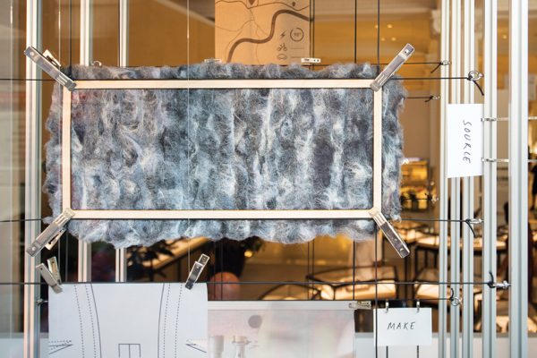
Handwritten messages and maker’s marks give full flexibility and a personal touch while reducing the kit of parts. Natural wool felt inserts cushion, protect and present Fay’s craft.
Customers treasure their jewellery as lasting impressions of time spent on the islands – our thoughtful collectable is integral to this evolving story.
Island Inspired
Discover & Collect
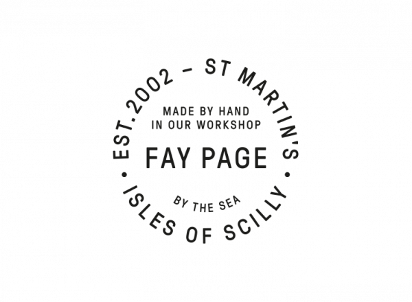
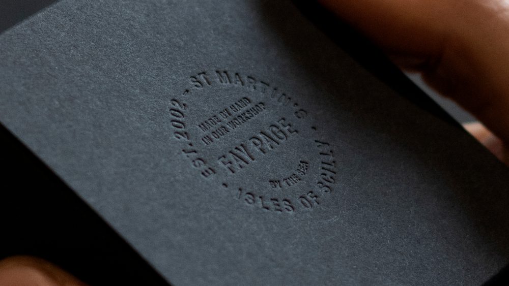
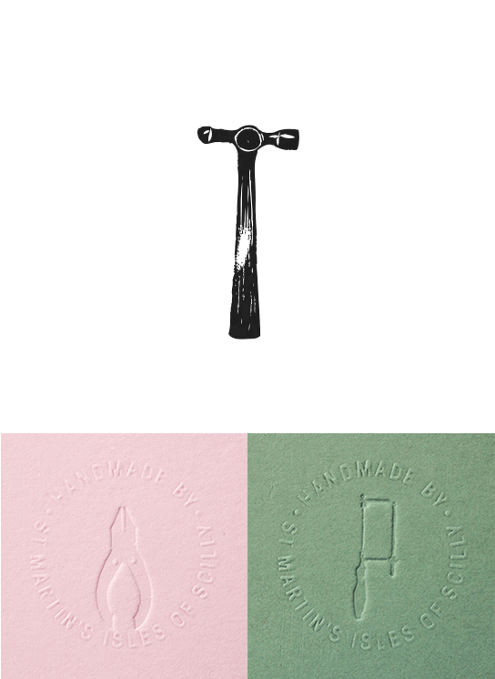
Maker’s Marks beautifully crafted by Fay’s daughter Daisy Davis
Crafted by the sea
All plastic packaging has been removed.
There is no print. Only embossed and debossed mark making.
No glue is used in the construction of the packaging.
Natural wool protects the collection.
One box, modular design
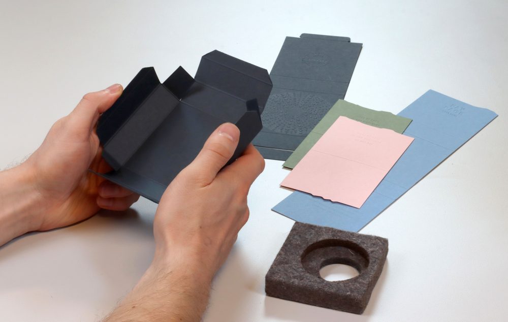
A single box designed to adapt and accommodate an inspired collection of jewellery pieces.
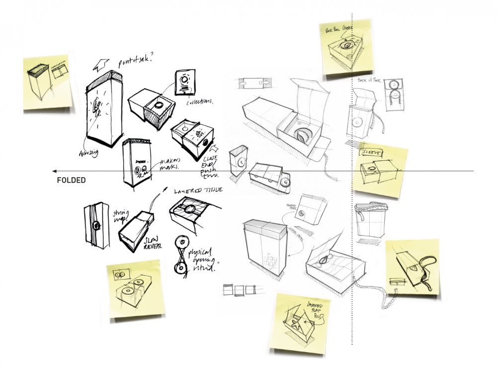
Explore > Develop > Refine > Make
Matter designed and produced some beautiful & unique packaging for our small jewellery business; the main focus of the brief was to be both reflective of our island home and fully sustainable. Working with an outside agency was a new thing for us and any nerves we had were soon set aside thanks to the teams support – they really engaged and worked hard to understand the nature of our business and product. Customer feedback has been fantastic and we are delighted with the end result.
Fay & Rob
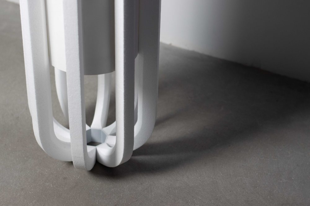
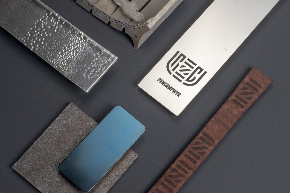
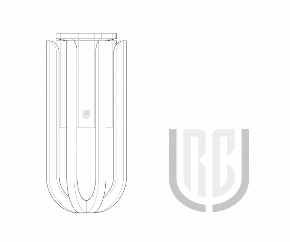
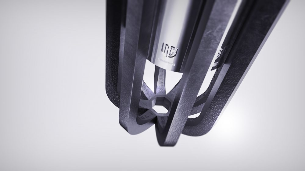
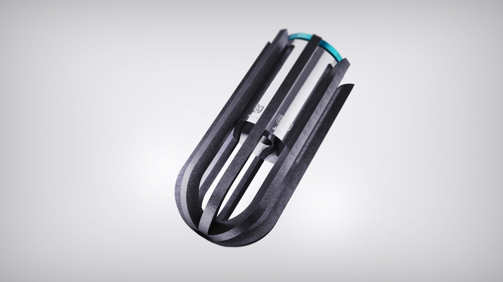
A DIFFERENT
LEAGUE
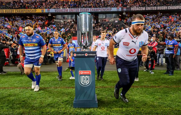
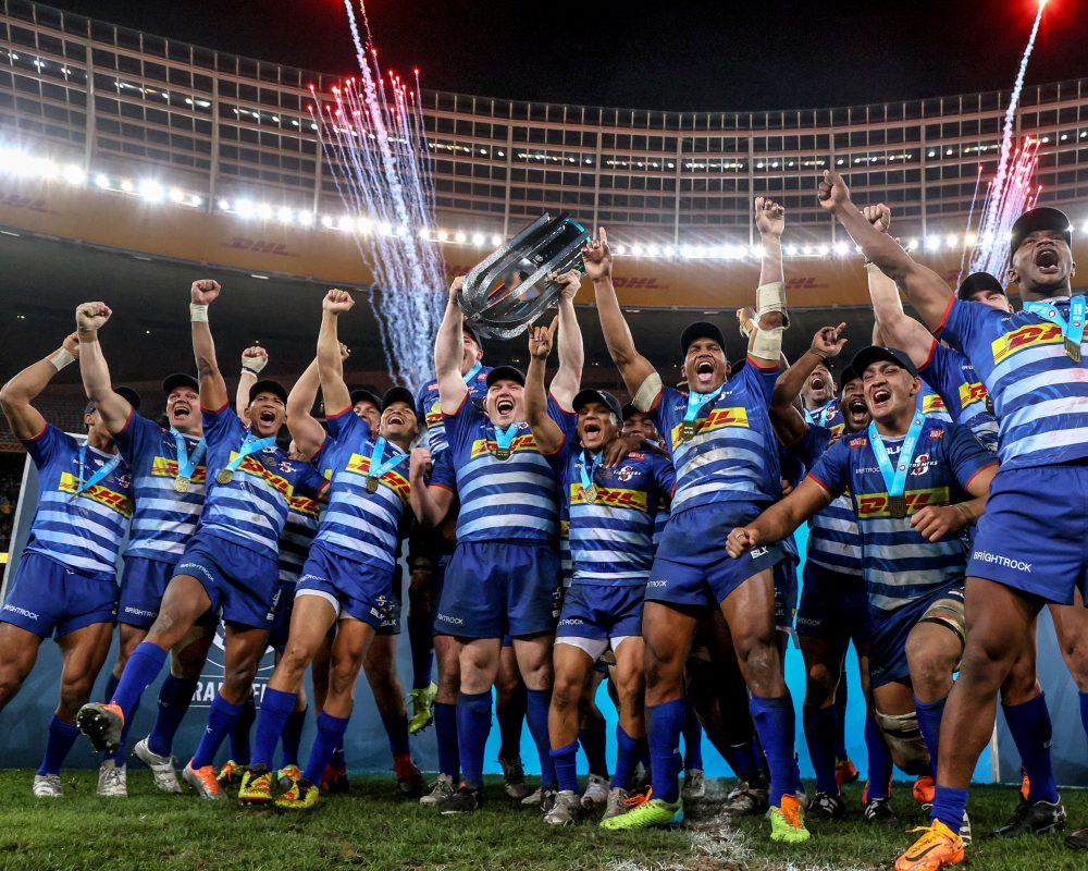
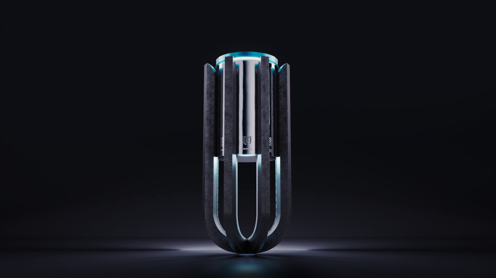
A progressive take on traditional trophy design, bringing to life the United Rugby Championship through its most important and iconic physical asset.
Array represents a progressive take on traditional trophy design. A truly united cup worthy of champions and a monument to incredible moments. With unique presence, it embodies the distinct values and positioning of the United Rugby Championship. A different League.
A successful rebrand of the United Rugby Championship (URC) led by Thisaway, positioned the URC to disrupt the sport and move Rugby Union forward into a league of its own.
Showcasing the extraordinary, through league stories that inspire, entertain and excite. Driven by a forever forward, innovative and positive spirit. And celebrating the diversity of culture and identity as their greatest difference. Unified, not uniform.

We were approached to implement the brand principles into one of the URC’s most important and iconic assets; the championship trophy.
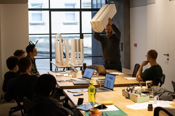
The project took a conceptual approach to explore ways in which to express the URC principles in physical elements, such as form, materiality and interaction.
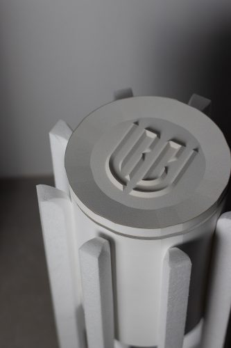
The breadth of early creative work allowed the team to collate a schematic concept with a physical presence and strong narrative, unique to the brand. From here the concept was refined for manufacture, with an immersive depth of detail into materials and finishes that bring cultural diversity, raw strength and progressive technologies in contrast with traditional, sterling silversmithing.
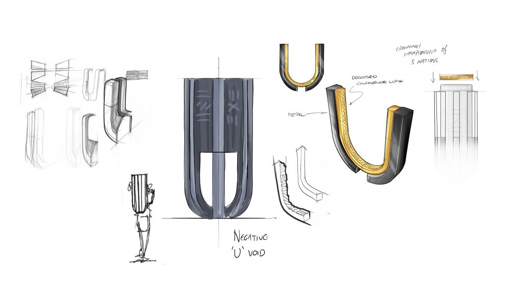
The external cradle is a collision of four U-forms, derived from the ‘U’ of ‘United’ in the URC logo. 3D printed in a super-strong alloy with a raw, pitted finish, The cradle is a progressive homage to the strength and power of the sport. Each U-form represents one of the four regional conferences. The cradle imbues the brand value of unity in visual iconography, regional representation and by providing multiple hand-holds for a team to raise the trophy.
Suspended in the centre, the vessel represents the championship. A traditional and exquisite piece of silversmithing, embellished with the history and stories of champions. Raised above, in dominant triumph, the crown is unique to each season and each champion. A piece that can be retained for trophy cabinets and a limited edition design asset for sponsorship partners, player medals and collectable fan merchandise.
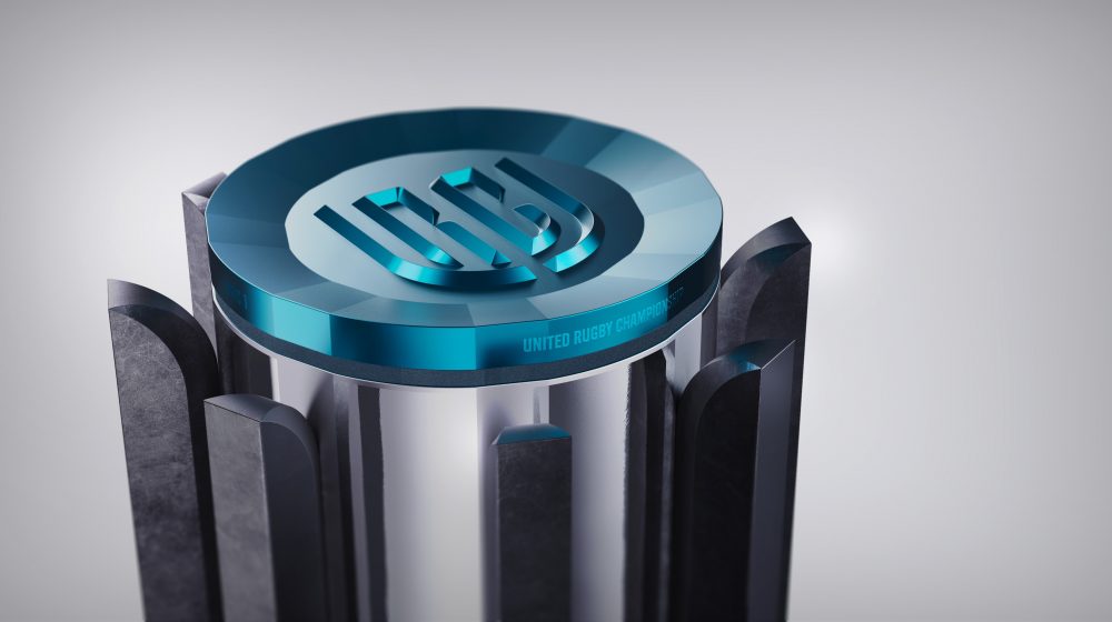
Designed primarily to be raised, held and celebrated, the trophy delivers on the scale and gravitas worthy of rugby champions. Engaging audiences at showcase moments beyond finals day was also a key aspect of the design, and on-plinth, the trophy can be illuminated and revolved to bring its full spectacle to life.
“From day one we knew there was a unique opportunity to create a trophy that was not only closely linked to the story of our brand, but also help the URC stand out in the world of sport.
Thisaway and Matter helped bring the vision to life with unparalleled creativity. They provided thoughtful ideation and exceptional execution throughout the process.
We believe we have created something really special, and seeing the players lift the trophy was a proud moment for us all.”
Tom Lister, Chief Marketing Officer
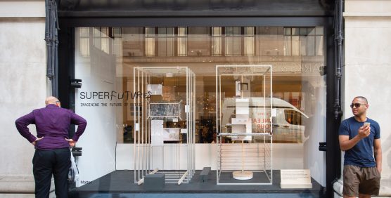
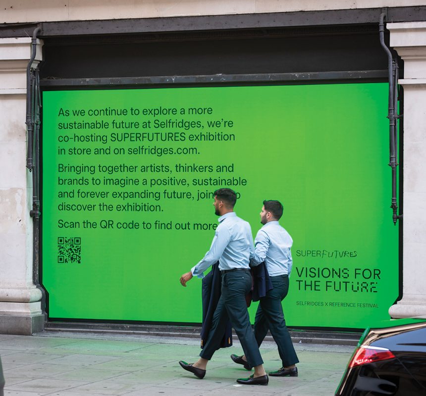
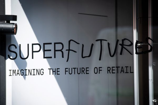
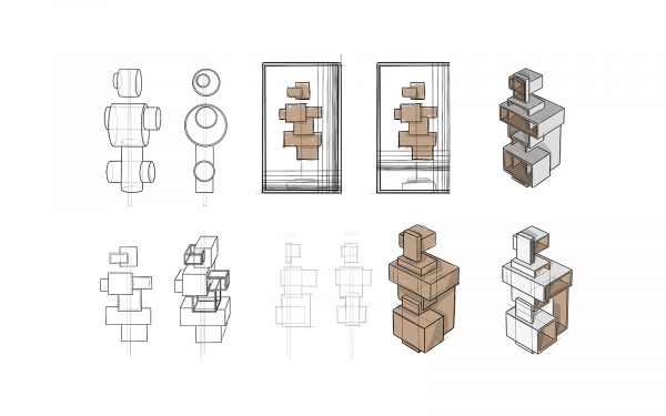
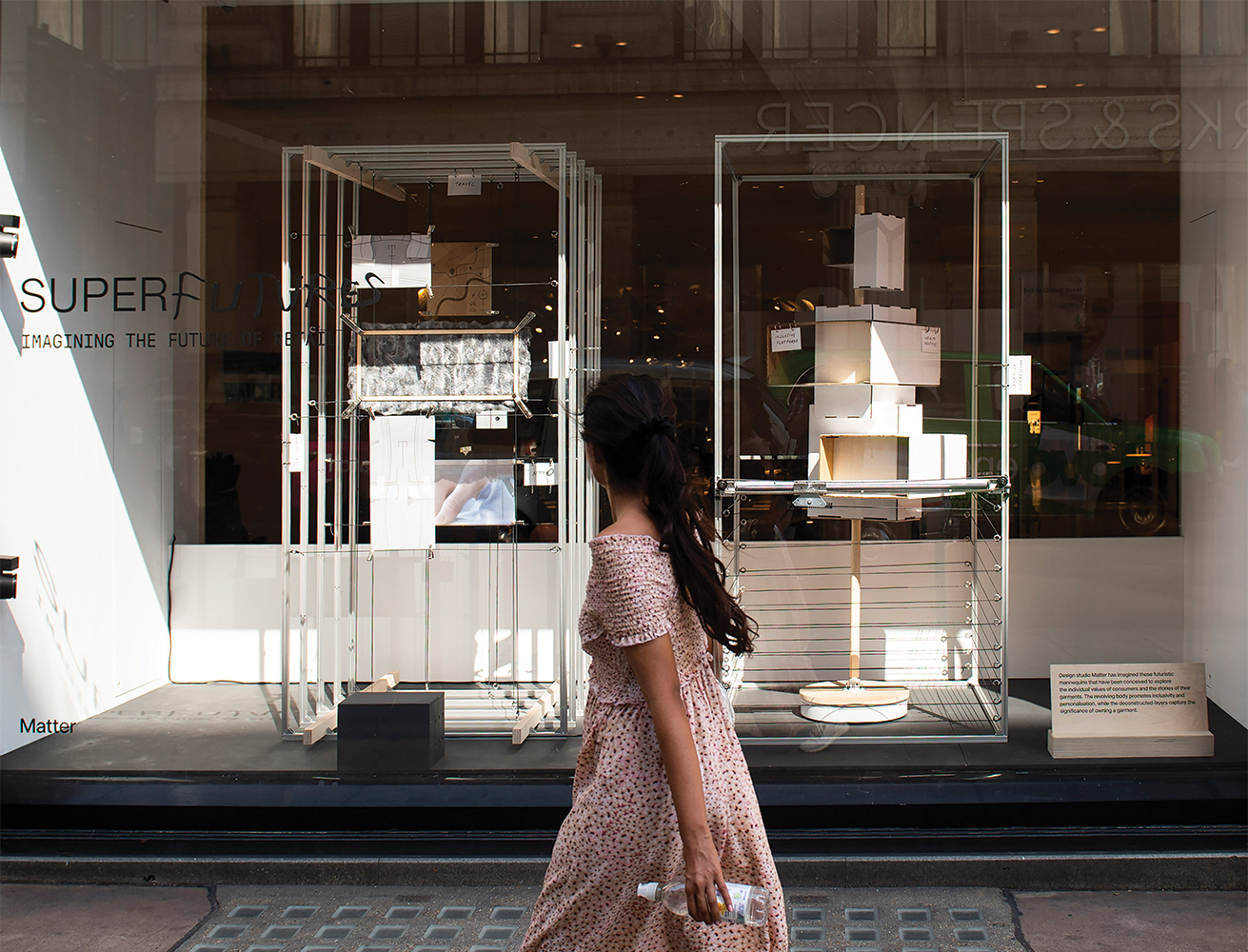
PROTOTYPES
FOR THE
FUTURE
Envisioning a future of retail as a work-in-progress window display for Selfridges, Oxford Street.
“Superfutures celebrates the journey and the process, the incomplete and the ongoing; not the finished and the polished. It exposes and probes what lies beneath the surface. The process that overall leads to progress. The art of reinvention. “
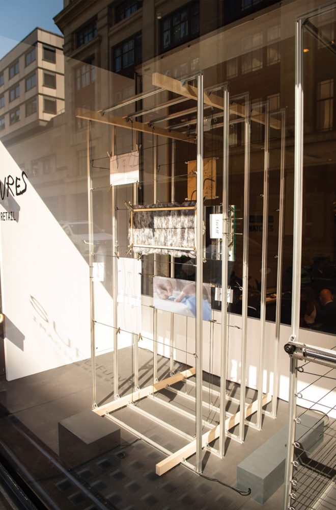
We were privileged to be approached by Selfridges to contribute our future thinking and prototyping expertise to their Superfutures campaign and to create and install one of their Oxford Street store window displays.
The challenge was to select an element of existing retail and re-imagine what it might become in the future, as a provocative window display. The installation piece was to manifest as a work-in-progress prototype, to demonstrate exploration and experimentation.
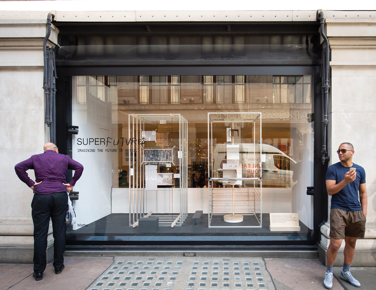
Our concept begins to explore the future of retail navigation and what might change to attract a new hierarchy of consumer needs and values.
We based our installation piece on mannequins, as traditional icons of department store retail. Developing one to represent aspirational supply chains and another to showcase inclusivity and personalisation.
Future Mannequin
From yesterday’s established consumer need to fulfil an aspirational self-image, we look to the future consumer who will navigate their purchasing based on deep and personal values.
Navigating generalised sizes and ephemeral silhouettes, will be surpassed by garments tailored to the emotional measurements of individuals. Environmental and social responsibility, individuality and inclusivity… these will be the new fabrics and appearances to be worn with pride and as a true reflection of self to others.
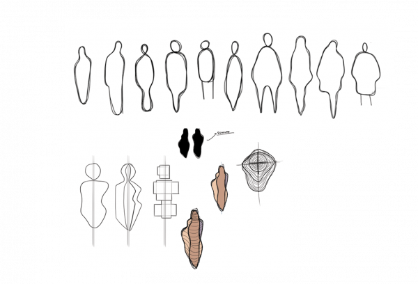

Traceability
Our traceability mannequin is a window into the story of our garments, connecting consumers to the origins, communities and processes behind their clothes.
Use of transparency and layers in the mannequin deconstruct garments to expose the aspirational and desirable supply chain in anamorphic perspective
Individuality
Our individuality mannequin is a showcase of infinite identities, inspiring consumers to create and express themselves within an inclusive garment platform.
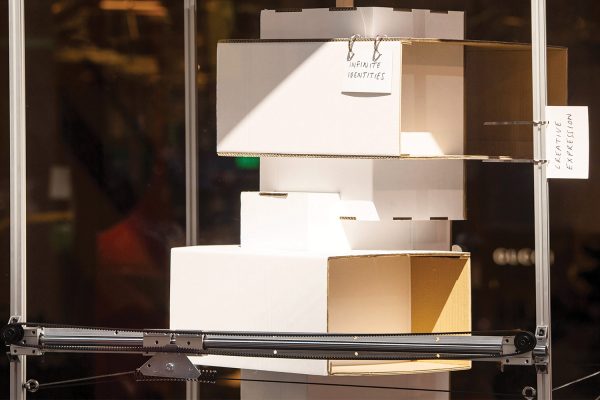
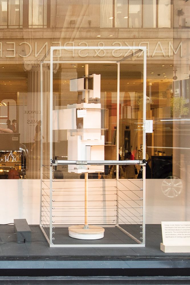
A transforming body shape offers an inclusive platform, while creative expression is demonstrated through the 3D loom.
Our installation was artistically directed by Selfridges to showcase a work-in-progress prototype.
We approached the concept development and installation in our usual way, prototyping, hacking and iterating. As a result the final pieces came together through taking an experimental approach to reach an honest, WIP result.
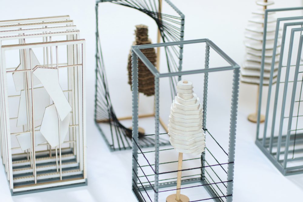
Scale models
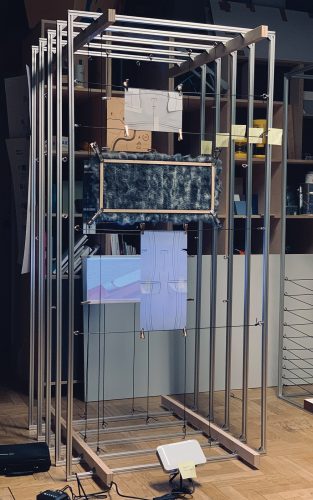
Full scale studio prototyping
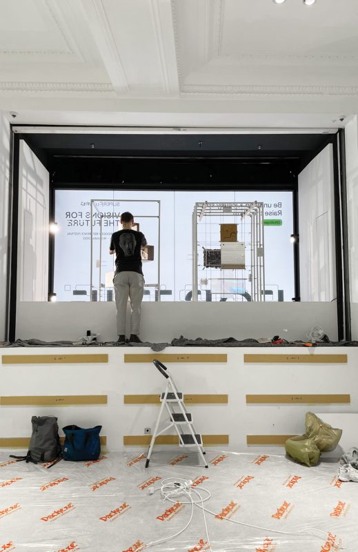
Installation, Selfridges London
What would be your ideal value-based measurements, fabrics and silhouettes, to be worn with pride and as a true reflection of self?
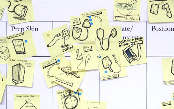
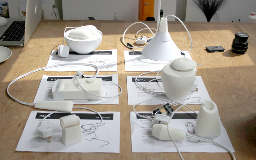
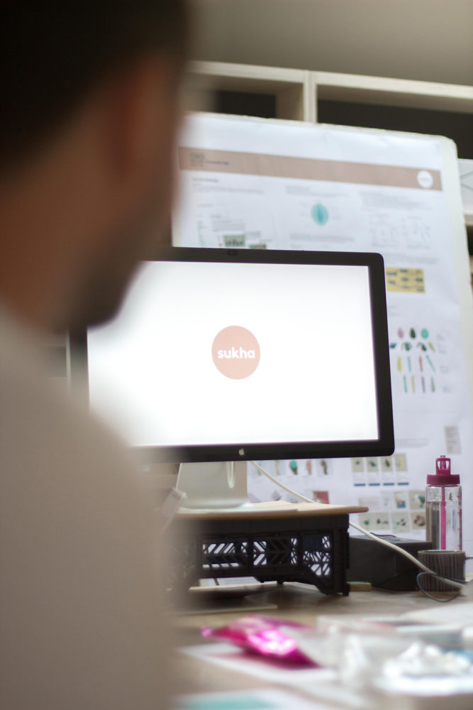
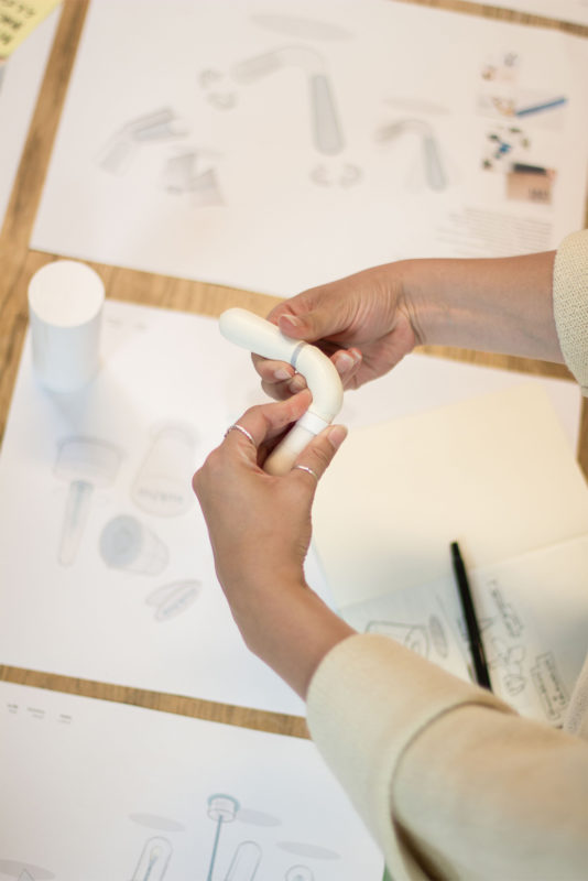
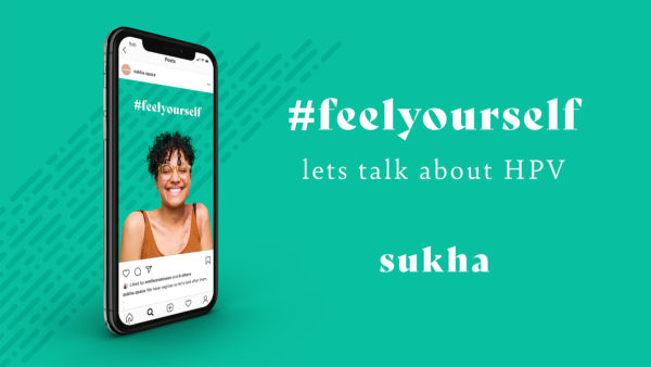
Engaging more
women in HPV
screening
Raising awareness, starting conversations and inviting personalised access to cervical screening through thoughtful holistic design.
Sukha (Su-kha) is a self initiated design exploration to engage more women in positive HPV screening experiences.
In 2019 1 in 4 UK women did not attend their cervical screening appointment; a vaginal examination, known as a Smear or PAP test. During which a cell sample is collected from the cervix and sent for HPV testing in a cytology laboratory.
Persistent infection with high risk types of HPV contributes to 99.7% of cervical cancers. So the test is a vital component in the fight against cervical cancer.
The aim of Sukha is to break down the barriers that prevent women from attending their cervical screening; such as a lack of knowledge, a lack of body confidence and the feeling of being disconnected and alienated from the process.
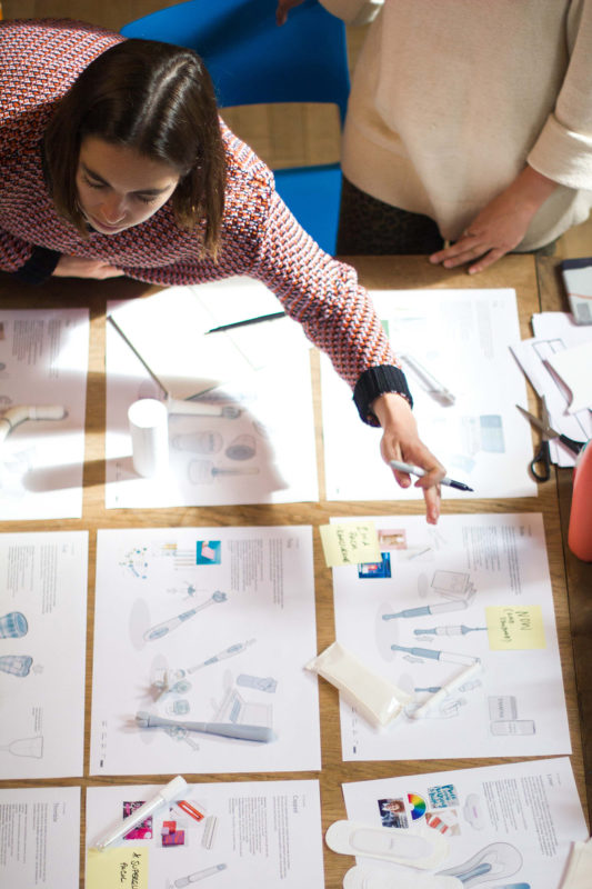
We believe there is an opportunity to engage more women through familiarity, trust and empowerment and we’ve developed three concepts under those opportunities that aim to provide an approachable, accessible and holistic offering in women’s health and wellness.
Our start point was to engage with women and gather experiential insights into the cervical screening process. As-well as gaining an in depth understanding of the technical aspects of sample collection and laboratory processes.
Exploring period care category
Through trend research and exploration of the health and wellness market, we identified a number of opportunity space to stretch our thinking and broaden our ideation territories.
Realisation of concepts into sketches and 3D sketch prototypes enabled us to facilitate consumer qualitative focus groups to evaluate, build and strengthen our concepts.
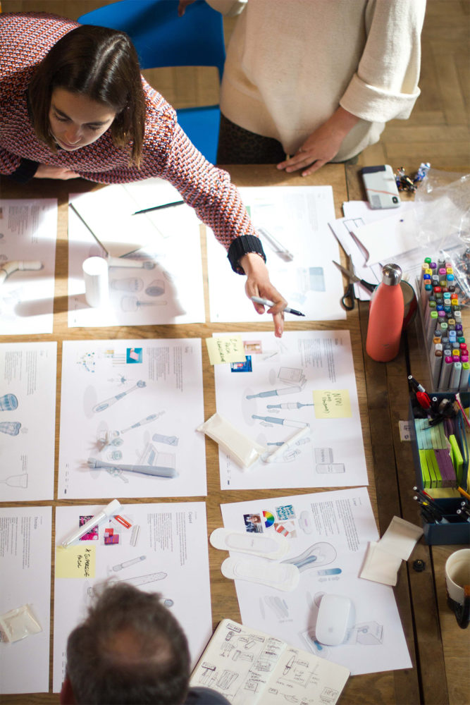
Concept evaluation
3D sketch models
Consumer focus groups
Your Space explores the routine and familiarity of the existing period care category offering women a compact sampling product with intuitive interactions. As well as creating a safe and comfortable forum for everyday conversation about HPV.
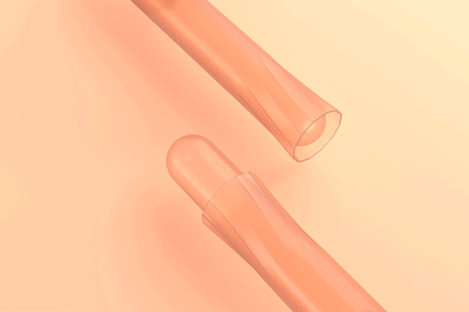
Your space sampling device
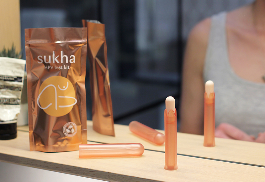
Concept prototypes
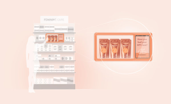
Retail concept
My Cycles smart device and app builds trust and understanding through personalised cycle-tracking and testing services for women at every life-stage. The concept integrates HPV testing as a key part of a life-long vaginal care regime, covering: menstruation, ovulation, STI & UTI testing.
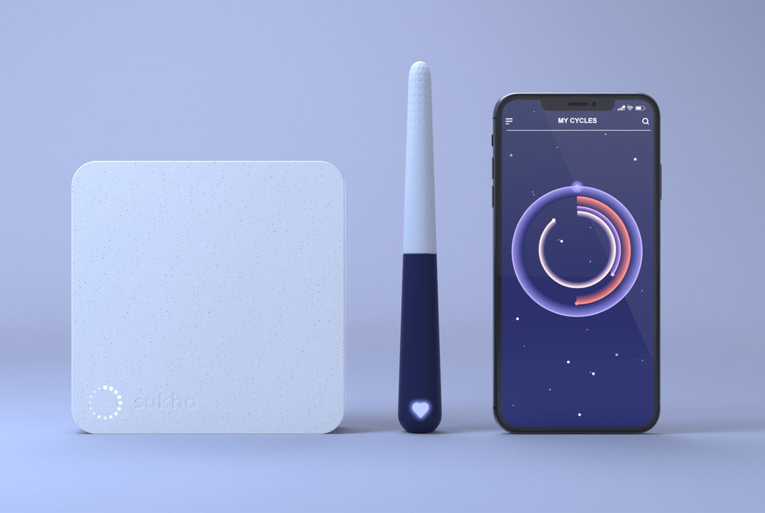
Concept: My cycles
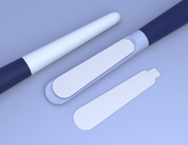
Cervical sample and urine test heads
My cycles case/charging unit
Our Bodies empowers women and celebrates self-exploration. Promoting body positivity by providing a naturally intuitive tactile sampling tool. The moulded silicone product fits comfortably to the finger and allows a woman to find, feel and collect a sample directly from her cervix.
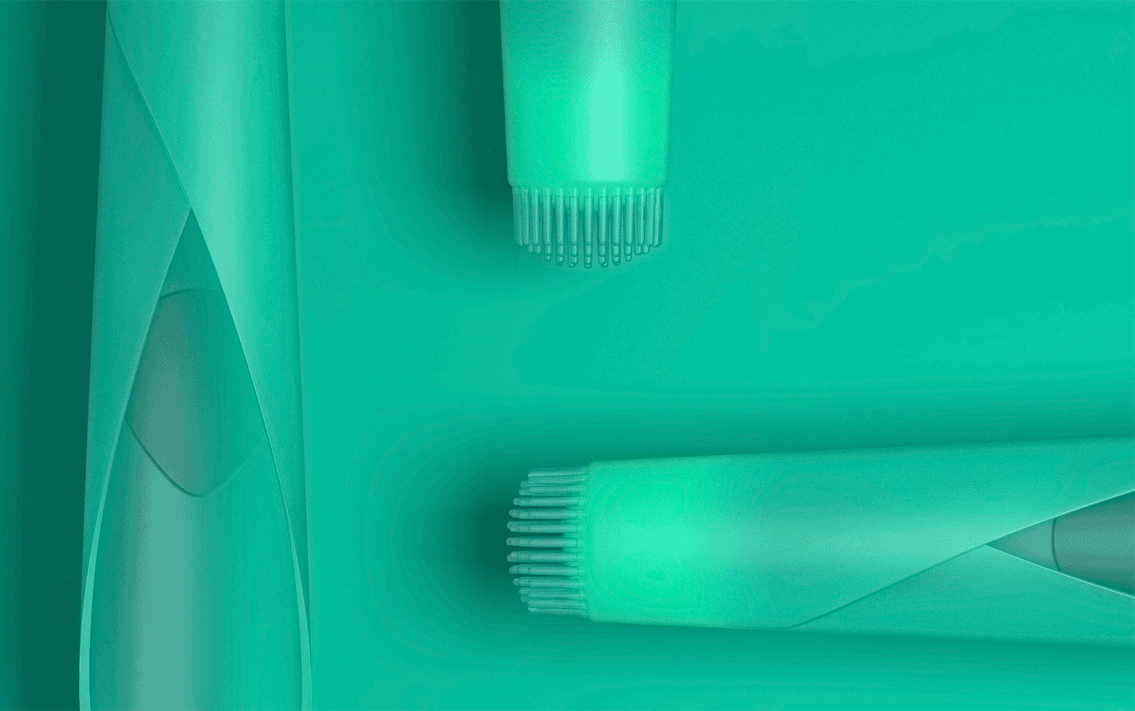
Concept: Our Bodies
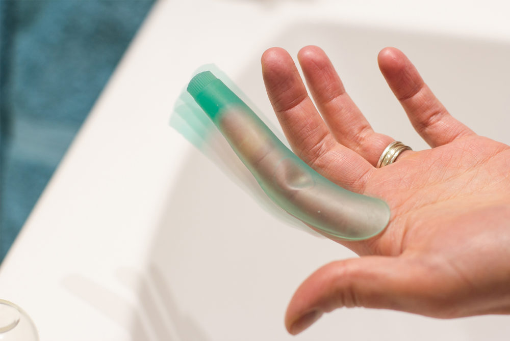
Tactile tool enables natural movement
Support campaign visuals
Sukha has been released as open source information with the aim to start conversations and engage more women in HPV screening. You can learn more about the concepts at sukhaspace.uk
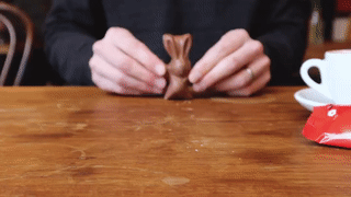
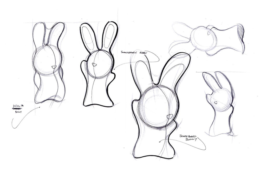
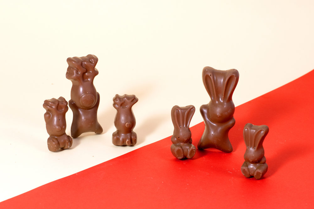
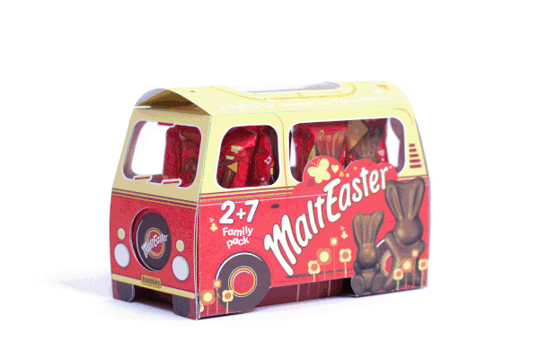
Outselling
an icon
Disrupting and winning in a dominated market, with emotive and brand lead new product development.
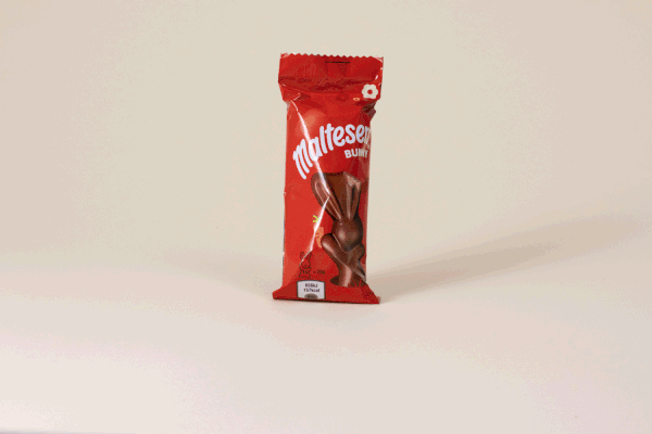
“The bunny brought in 246,000 new customers to the Easter Self-Eat segment”
MaltEaster DBA Submission

You don’t often get a brief to design an icon. We worked closely with the brand and manufacturer to design, develop and scale the self eat range.
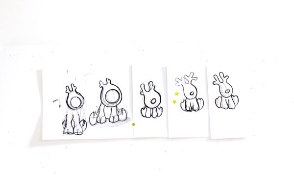
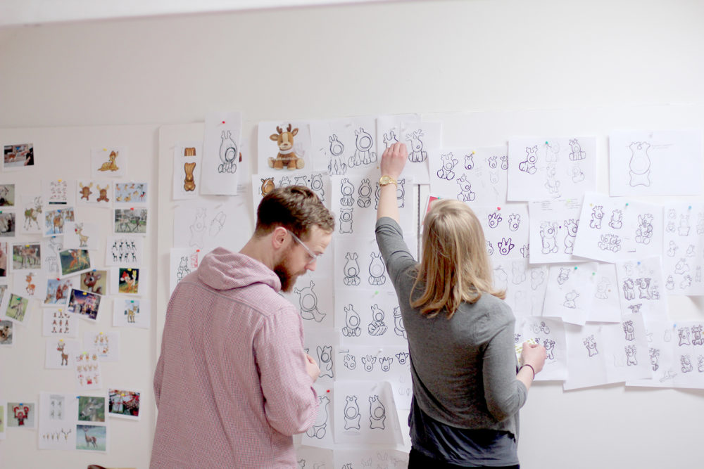
In year one the Malteaser Bunny outsold it’s competitors and has since won a DBA, made like bunnies to create mini bunnies, bought a camper van for spring time adventures, and warmly welcomed their playful reindeer friends to the party.
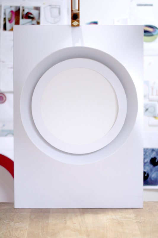
CANVAS
FOR
CREATIVITY
Partnering with a start up to develop and launch a sustainable product for kids creative play.
Ready for adventure?
Cub Box has been dreamed up, designed, manufactured and launched within the year.
Inspired by their young family, Rose and Ed set up Cub Box in 2019 and we were lucky enough to join them at the early stages to develop and launch a sustainable product for kids creative play.
Simplicity ignites imagination, this product should only be the canvas… We developed the creative direction and themes for the brand, to inspire playtime for our future explorers, adventurers and environmentalists.
We developed the creative direction and themes for the brand
A breadth of structures were explored and iterated in 3D
We explored and iterated a breadth of structures in 3D before settling on Echo and Scout as our Cub Box pioneers. As well as being fully recyclable and made from 90% recycled material, the challenge was set for easy assembly without fixings and ability to be flat-packed and re-packed to store under a sofa.
“Our ambition is to Inspire the next generation of adventurers, environmentalists and explorers.”
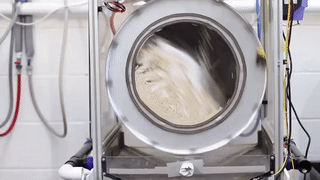
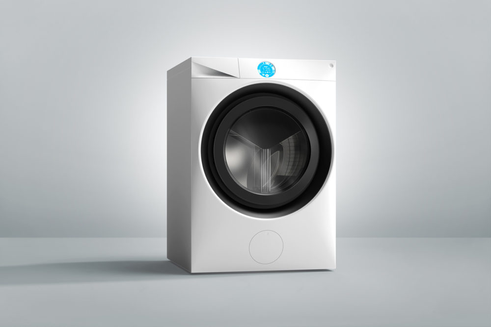
DO MORE WITH
LESS WATER
Exploring polymer fabric care in a consumer context and creating the first in home proposition for the revolutionary bead cleaning technology.
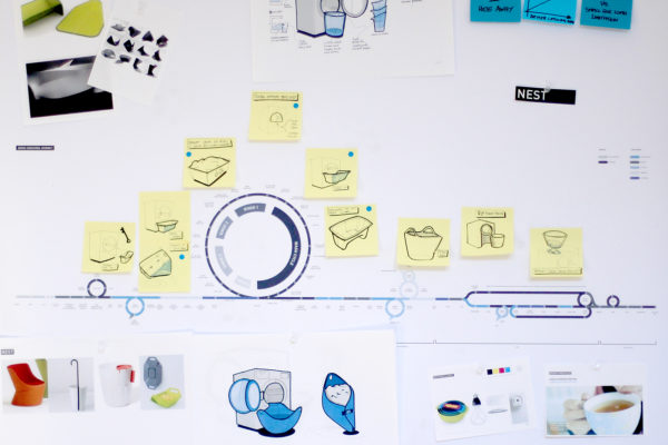
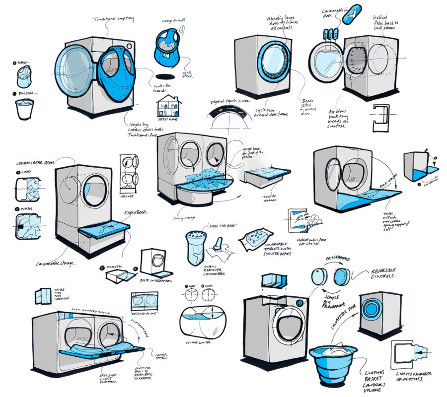
The brief was to create an in home, consumer concept for the patented bead cleaning technology, currently used in commercial laundry.
Through mapping out a detailed user experience journey and exploring the necessary interactions through full scale rigs, we identified the habitual changes from common laundry processes. This informed the project to further explore the interaction design. It also highlighted that the product positioning and design language would be crucial to ensure new users understood there was a step change to be adopted, and the benefit that it would deliver.
Concepts were developed quickly through 2D / 3D sketch work, and evaluated through testing functionality and intuition with rigs and reviewing consumer perception of new formats.
The process continued by refining the lead concept through an iterative, hands on approach that brought every element and touchpoint to life.
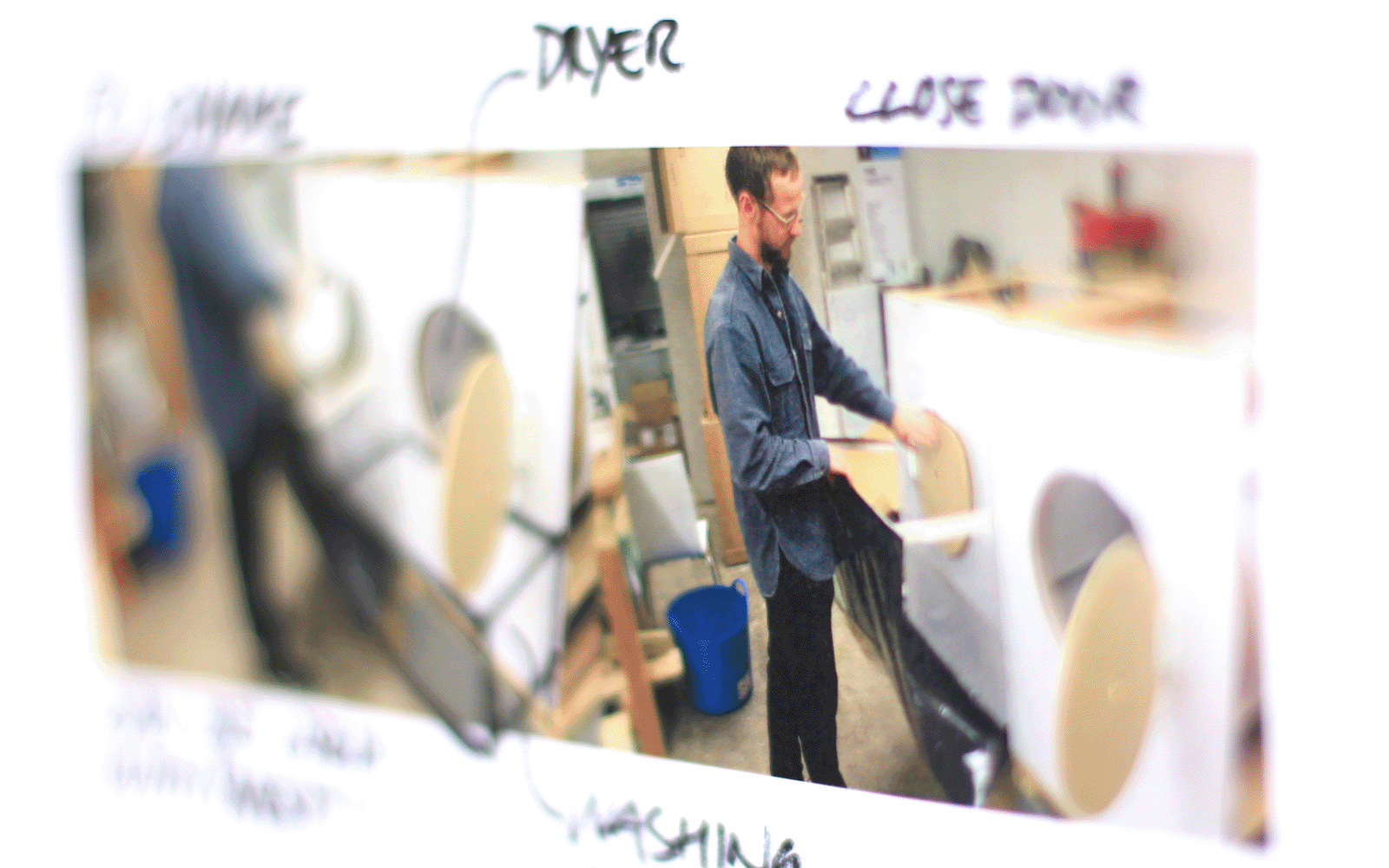
Iterative 3D development and testing with rigs.
Ideation was structured around detailed mapping of user experience.
We worked in collaboration with Freshworks, our technical design partner, along with with experts in digital programming and textiles development.
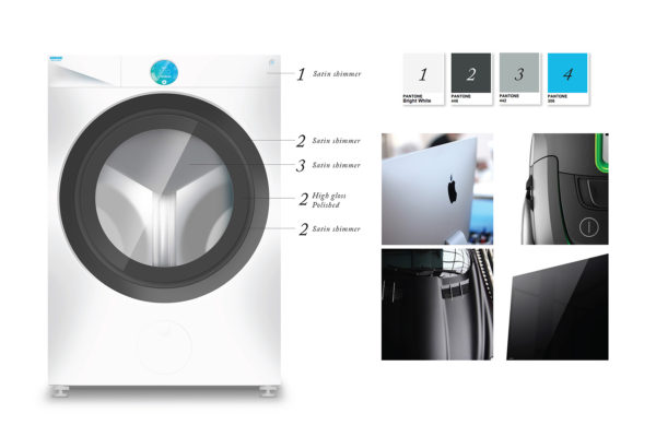
A unique design language was crucial to communicate the technology step change.
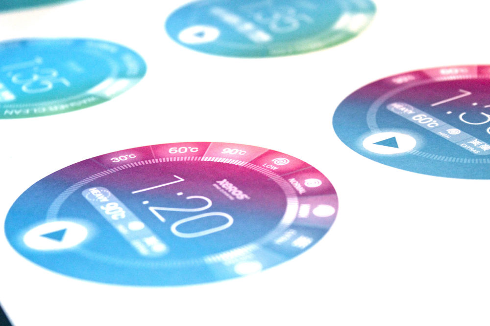
User interface design and integration into final prototype.
50L
HOME
Bringing to life the vision of a 50L Home. A P&G spearheaded initiative, selected as a top 100 lighthouse project for 2020 by the World Economic Forum.
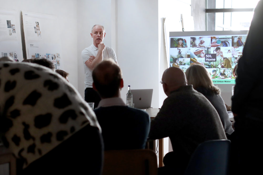
Major cities around the world face the prospect of a water crisis, and 14 of the world’s 20 largest cities are already experiencing water scarcity.
We are working with P&G to explore opportunities in reducing and reusing water within the home. The breadth of our involvement includes facilitating creative workshops, inspiring concept visions for the future and early product prototypes.
P&G serves nearly 5 billion people around the world with its brands, 70% of which are based around household water jobs. With this scale of user engagement, an open and collaborative approach and brave design thinking, we are excited by the potential for change.
“The 50L Home will make water reduction & efficiency irresistible, such that 50L per day per person feels like 500.”
Frantz Beznik, R&D Director, Global Head of Sustainable Innovation at Proctor & Gamble
Universal
Colourful
Fun
Defining distinctive creative principles for a #1 global brand and translating them into a coherent product ecosystem.
As part of the ‘A-Team’ agency partnership, we lead creative direction on product and packaging design for the brand.
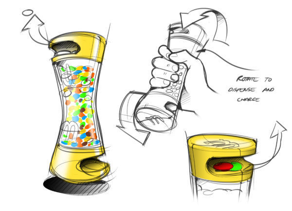
We have designed key items for the portfolio, applying a bold, coherent design language and irresistible interactions that appeal universally to all ages.
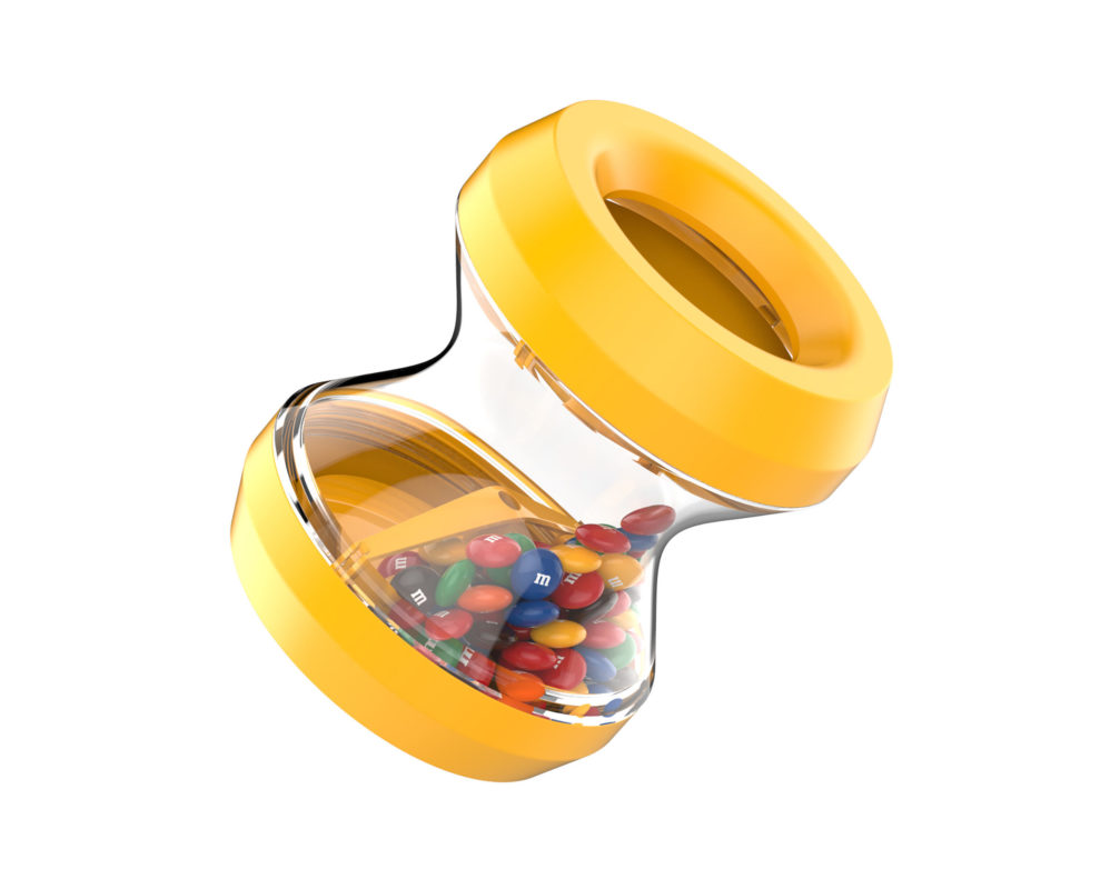
The Flip dispenser; minimal components, maximum interaction.
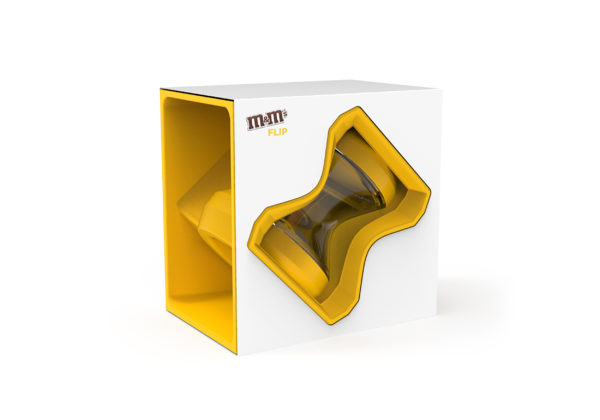
Moulded paper packaging: framing the product.
Several products are available in market today, while several remain up Red’s sleeve ;0)

Brand
Various
Food
Futures
Matter identify upcoming food trends, and translate them into brand specific concepts and experiences that fuel product pipelines.
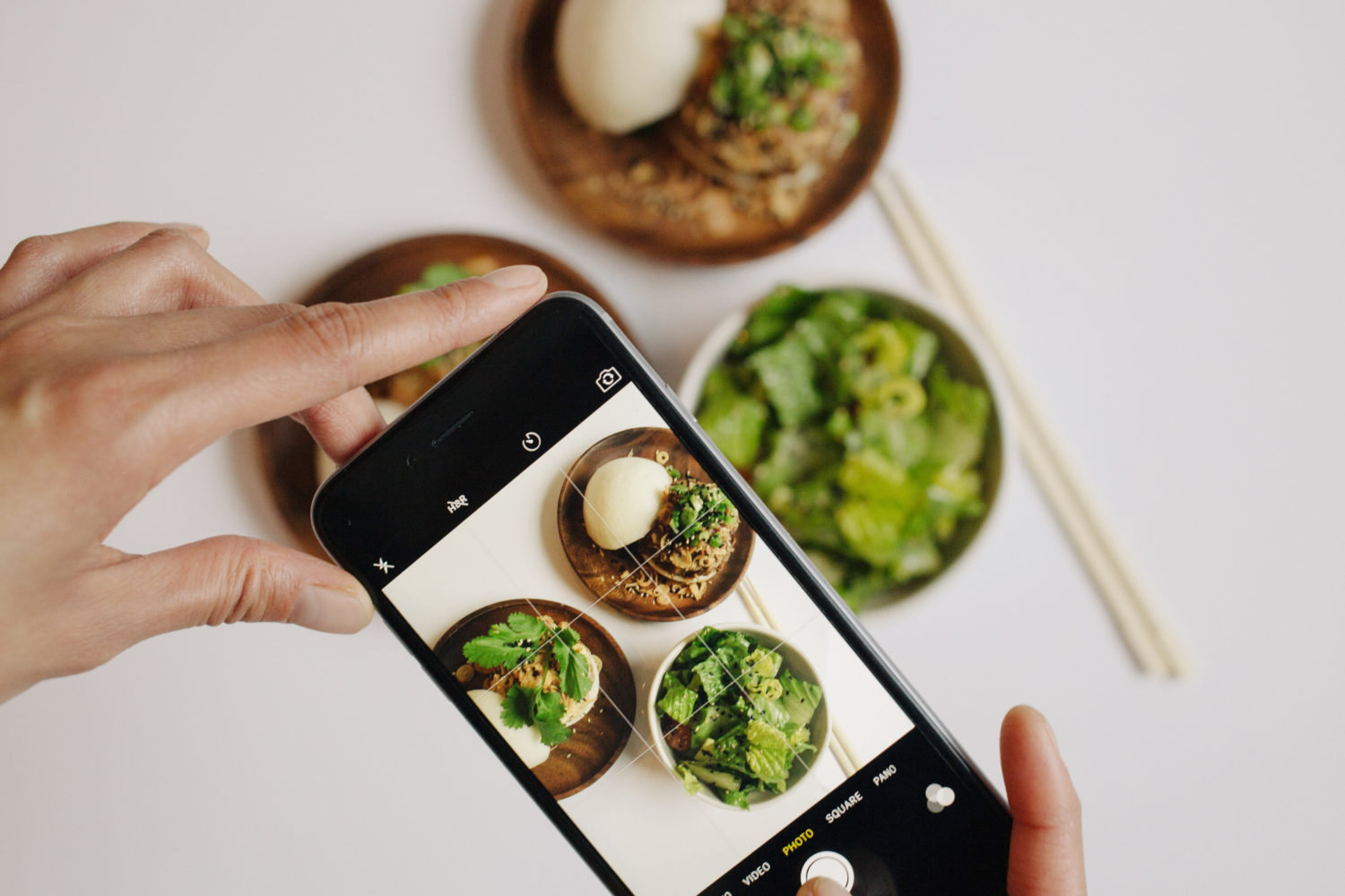
Instagram Plate
Food is a source of entertainment and a focus of our social diaries.
The instagram plate is common place and companies are evolving their retail space and business model to fit with a new generation of consumers.
Experience is at the heart of their enjoyment, and whilst food and drink still needs to taste great, it is an exceptional experience that these new consumers crave.
We have been working closely with brands in the Chinese market to develop the theatre and creative experience being demanded in food retail by the Wang Hong generation.
Experiential retail cloud coffee
For years, the food industry has been steering consumers eating habits and relying on select ingredients from a global pantry of ‘perfect’ produce.
But social and environmental factors are driving industry change in both product and packaging. Manufacturers and retailers are re-addressing the way they conduct business, in order to provide desirable, consumer relevant, sustainable food options and to stay competitive in an ever changing marketplace.
Reducing meat consumption and the shift towards Veganism, is a popular trend and one we have been aware of and working with for a number of years.
Through the facilitation of co-create workshops, including desirability, feasibility and viability business functions, Matter have helped to identify a number of opportunity spaces. Diversifying a high-risk, ‘red meat’ based business, to one with a portfolio offering a range of products using alternative protein sources.
Trending plant based diets

Future protein sources
Todays consumers are ever more aware of the contents of their food and it’s nutritional benefits.
Reading the back of a pack for nutritional information has become a consumer habit and ‘free from’ products an expectation. Consumers are demanding transparency on ingredient ethics and sourcing, and are looking for products to do more than just fill them, but provide targeted,
personalised nourishment, including health and wellness benefits. Our work in food futures is helping to shape the boundary’s in the emerging space where food nutrition meets beauty benefits.

Inner beauty
Targeted nutrition supplements
We gather future food, technology and manufacturing insight from sources such as the future laboratory briefings, food matters live and food and drink expos.
We’re always excited to share our take on the future of food and drink with new clients and get involved in bringing a new vision to life.
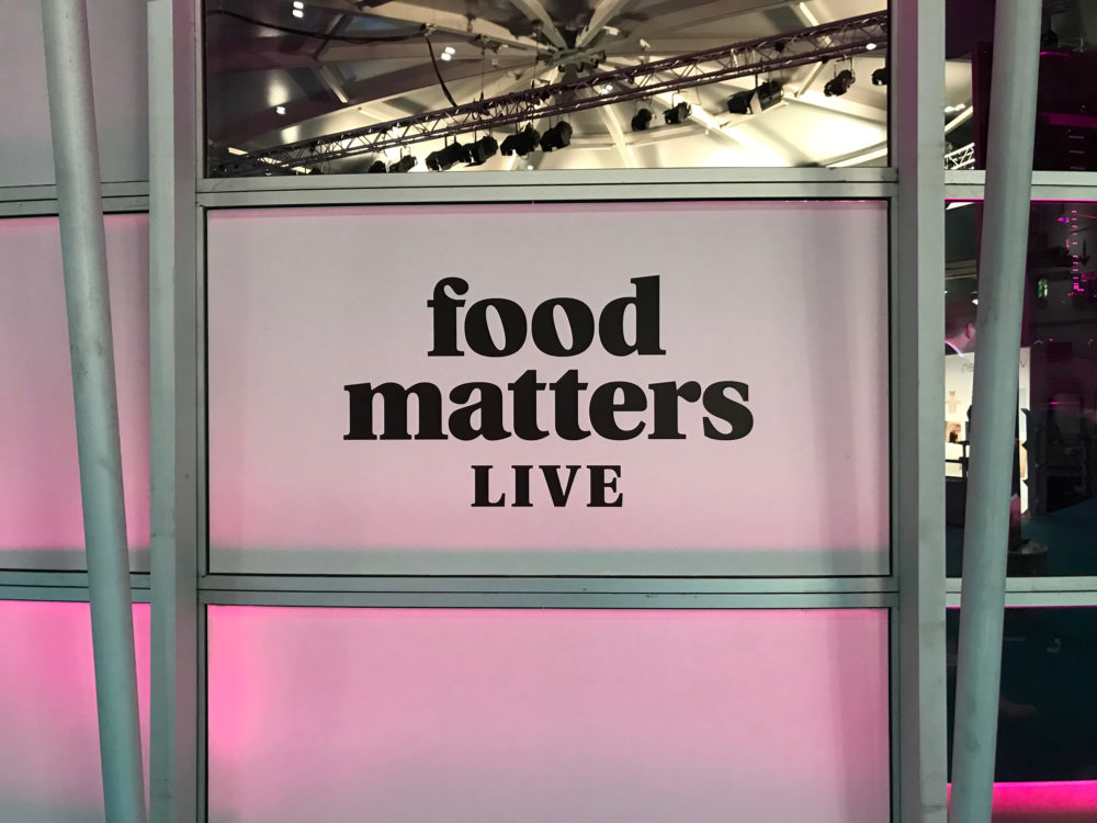
Food matters live
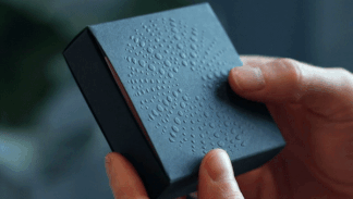
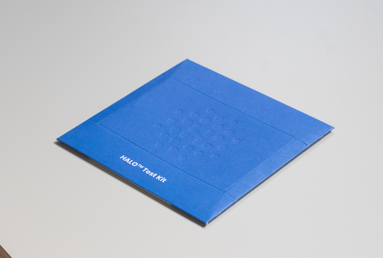
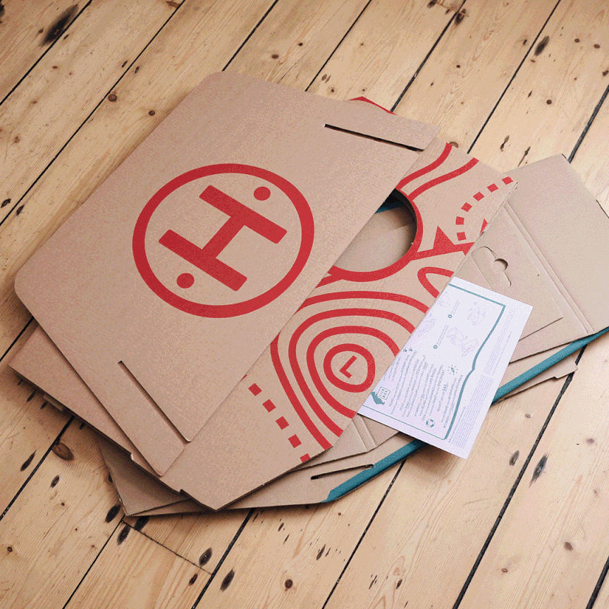
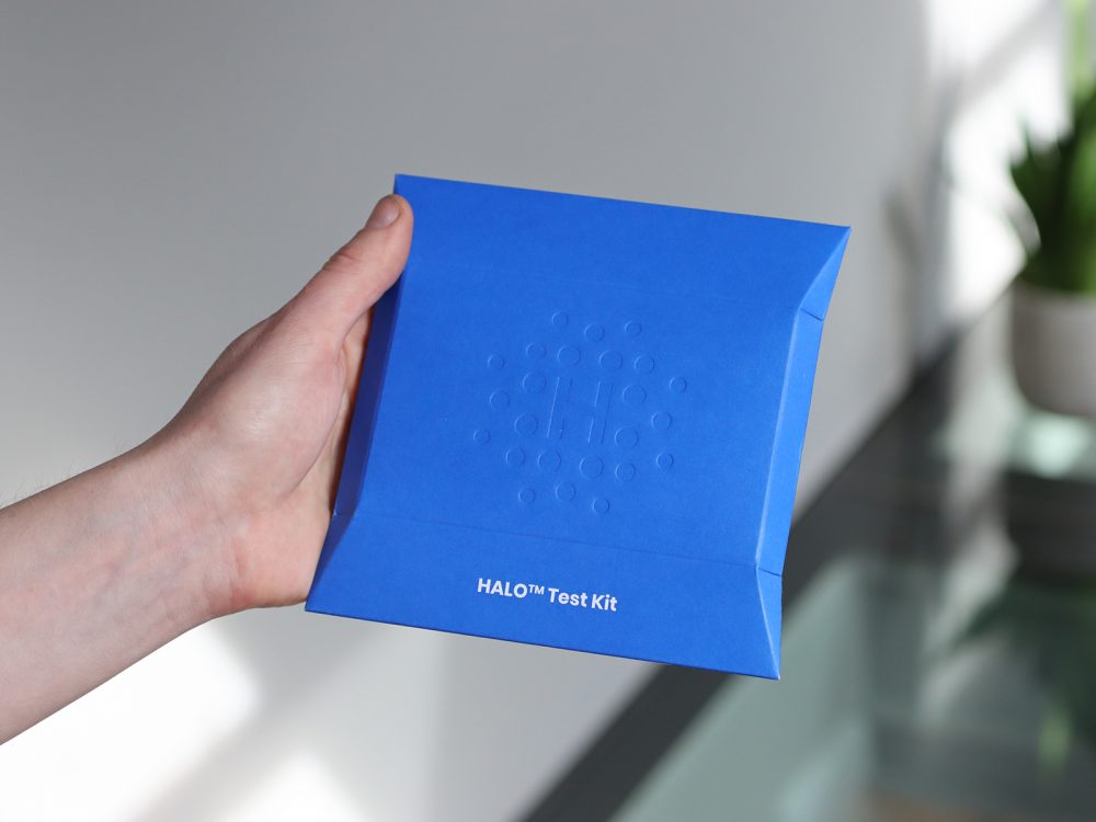
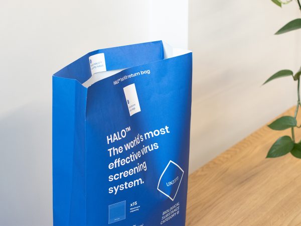
A NEW ERA OF
DIAGNOSTICS
Fast-paced development, supply and collaborative support to deliver a unique test kit for a pioneering virus screening system.
Halo™ is a UK Government approved COVID-19 testing system. In June 2020 we partnered with the start-up to design and supply their packaging. We successfully delivered full production test kits to users within 3 months of initially discussing the challenge.
The Halo™ system combines highly accurate, painless, saliva-based sampling, a door-to-door courier service, gold-standard government-approved PCR testing and a secure, encrypted app.
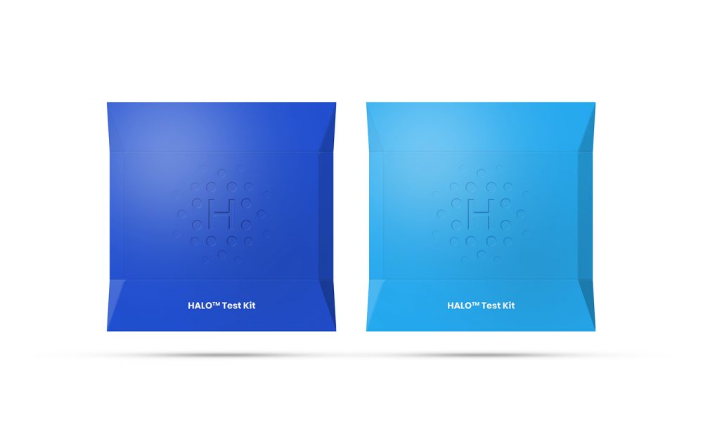
This packaging solution is the first returnable paper envelope to be implemented in the fast growing home testing segment. It provides a solution at a low cost and low environmental impact to a new era of mass testing programs.
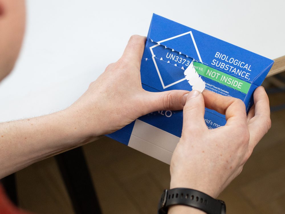
Our approach led us to develop and register a unique capacity envelope, providing the cost and environmental efficiencies of a simple, paper envelope. It is fully compliant with UN3373 biological substance guidance. An integrated 3D structure simply pops up to hold and protect the contents. The material, finish and detailing elevates the simple envelope to a high quality piece of stationery which reflects a premium, trustworthy service.
When compared with other home testing kits and UN3373 packaging on the market, Halo™ offers a more responsible pack design. This has been achieved by using a single, renewable and recyclable material and refining the design to be as light weight and compact as possible. Crucially, the ability to reuse the primary pack for the return, negates the need to include a plastic returns wallet.
EU registered design EU008106835-001, made by matter.co.uk
Typically home-test packaging consists of heavy card boxes, plastic wallets and additional return packaging.
The enormous number of test kits required to create an effective Covid-19 screening system inspired us to rethink the typical solutions and deliver on sustainability, trust and functionality.
Our unique pack solution is now registered and owned by Matter. We are working with other new partners to role out the technology in new sectors.
EU registered design EU008106835-001, made by matter.co.uk
Graphic transformation reveals UN3373 Biological Substances markings for compliant returns.

We entered this project in the true spirit of a collaborative start-up; to do what we could, to get the important testing service to market successfully and as fast as possible. Our role was to design the packaging, but we also took on sourcing the supply and fulfilment. We connected with the various components of the Halo™ system, including distribution, app development and the testing labs to refine a holistic solution.
In order to fulfil the initial low volume orders, we partnered with local print finishers for short-run supply and completed initial packing and shipping of the first 1000s by hand, from our studio in Bath. We even undertook the personal delivery of kits to T5 Heathrow, in order to meet early demand.
We now continue to support Halo™ across a number of elements, including collection boxes and multi-return packaging, test-to-travel kits, testing facility communications and bespoke iterations for new customers.
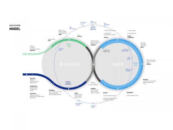
We connected with the various components of the Halo™ system to refine a holistic solution.
PCR test kit, LAMP test kit
Multi-return envelope
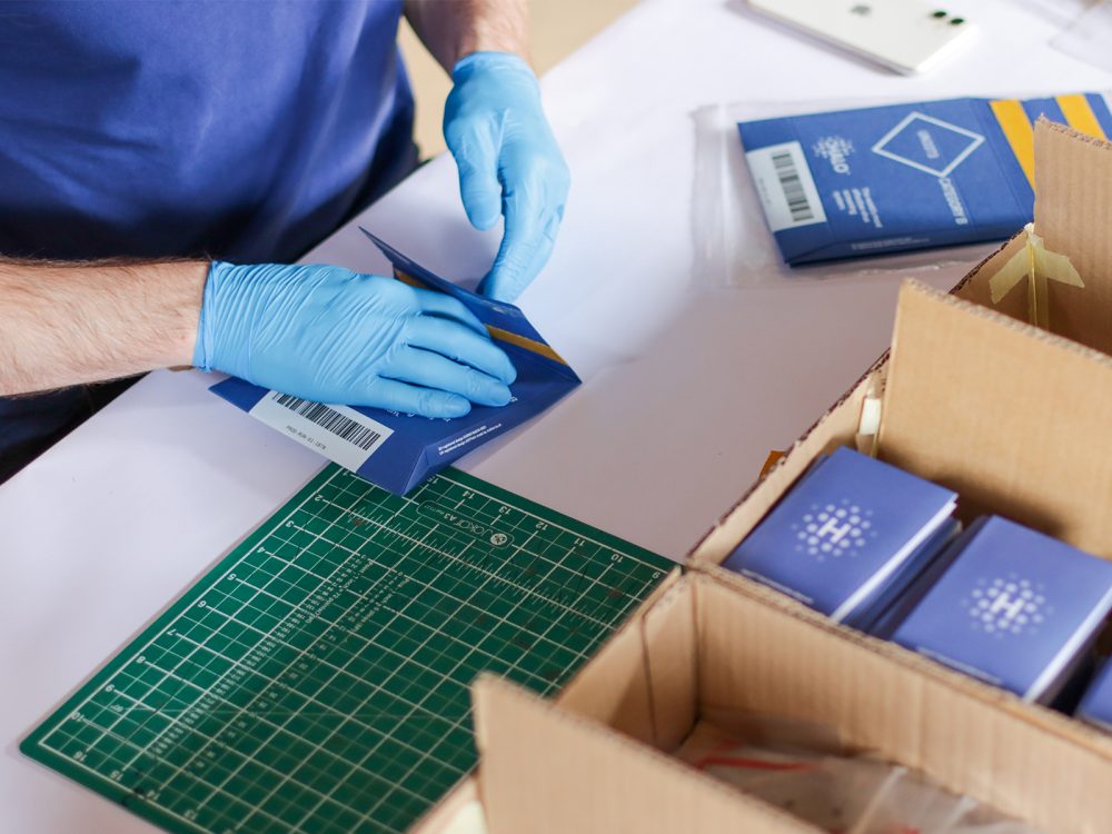
We completed initial packing and shipping orders by hand from our studio in Bath.
“Halo has increased testing by over 300% in the last quarter, processing up to 2000 tests per day and serving the airline, hotel, transport, defence and education sectors. Halo continues to offer enhanced services such as test to release, test to travel and same day testing as well as improving testing techniques, supporting research for future prevention.”
Alistair Ruffett, Head of Operations
“I’ve got to say the results have been amazing. The packaging has won universal praise from customers to highly experienced operations people and it’s been rigorously tested; tens of thousands of tests have been sent out and returned. It works.”
Ian Henderson, Founder of Halo
We are incredibly proud to have supported the Halo™ team in bringing their world-leading virus screening system to market and to serve the Covid-19 pandemic response. Difference, made.
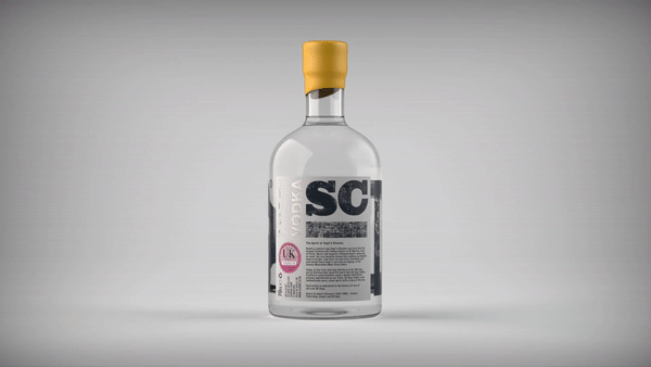
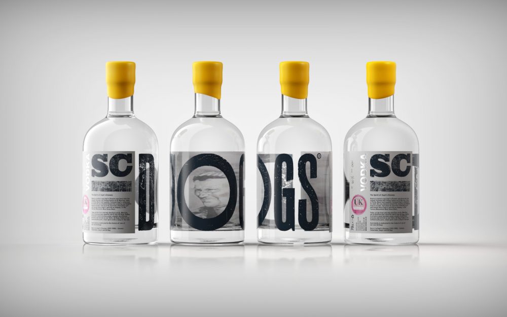
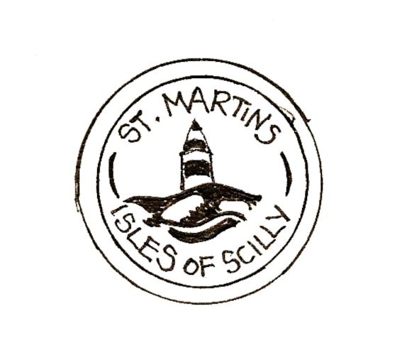
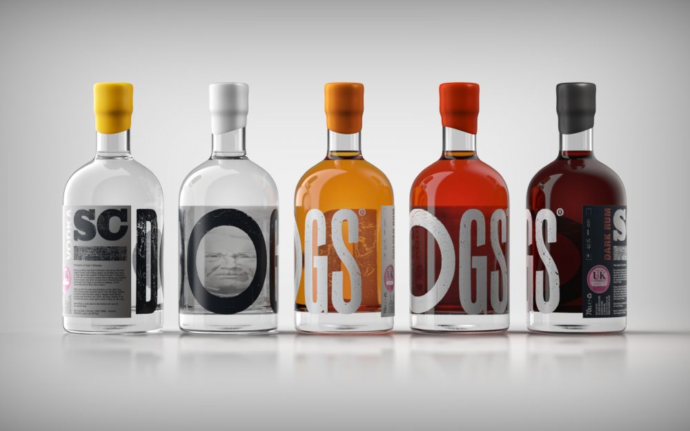
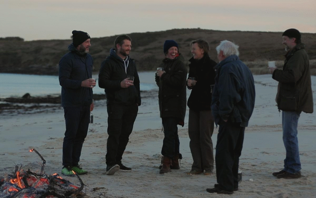
Indomitable
Spirit
Creating a unique yet pragmatic brand & pack vision for the first and only rum distillery on the Isles of Scilly.
SC DOGS – Spirits of St. Martin’s videography by Christopher Tirrell
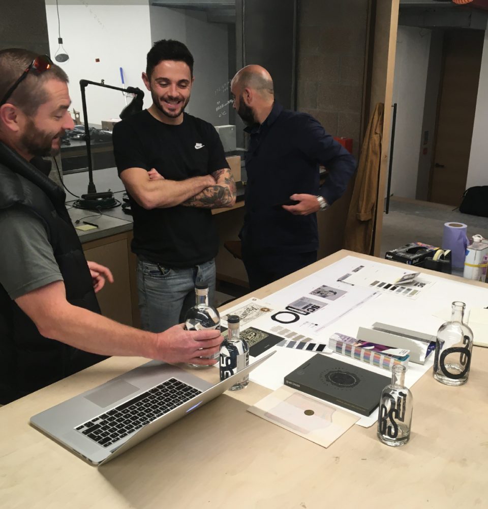
Collaborating closely with a multi-disiplinary team of exceptionally talented creatives, we guided the creative process, establishing the SC Dogs brand and the stories distilled into each bottle.
Creative Director – Richard Stevens
Cornish Artist – Imogen Bone
Letterpress Typographer – Mr. Smith
Copywriter – Ian Henderson
Videographer – Christopher Tirrell
The spirit of Capt’n Stevens

A mark of provenance.
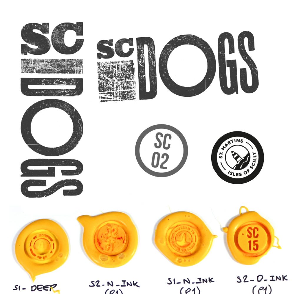
Brand marque exploration
St. Martin’s makers & producers mark by Sue Lewington
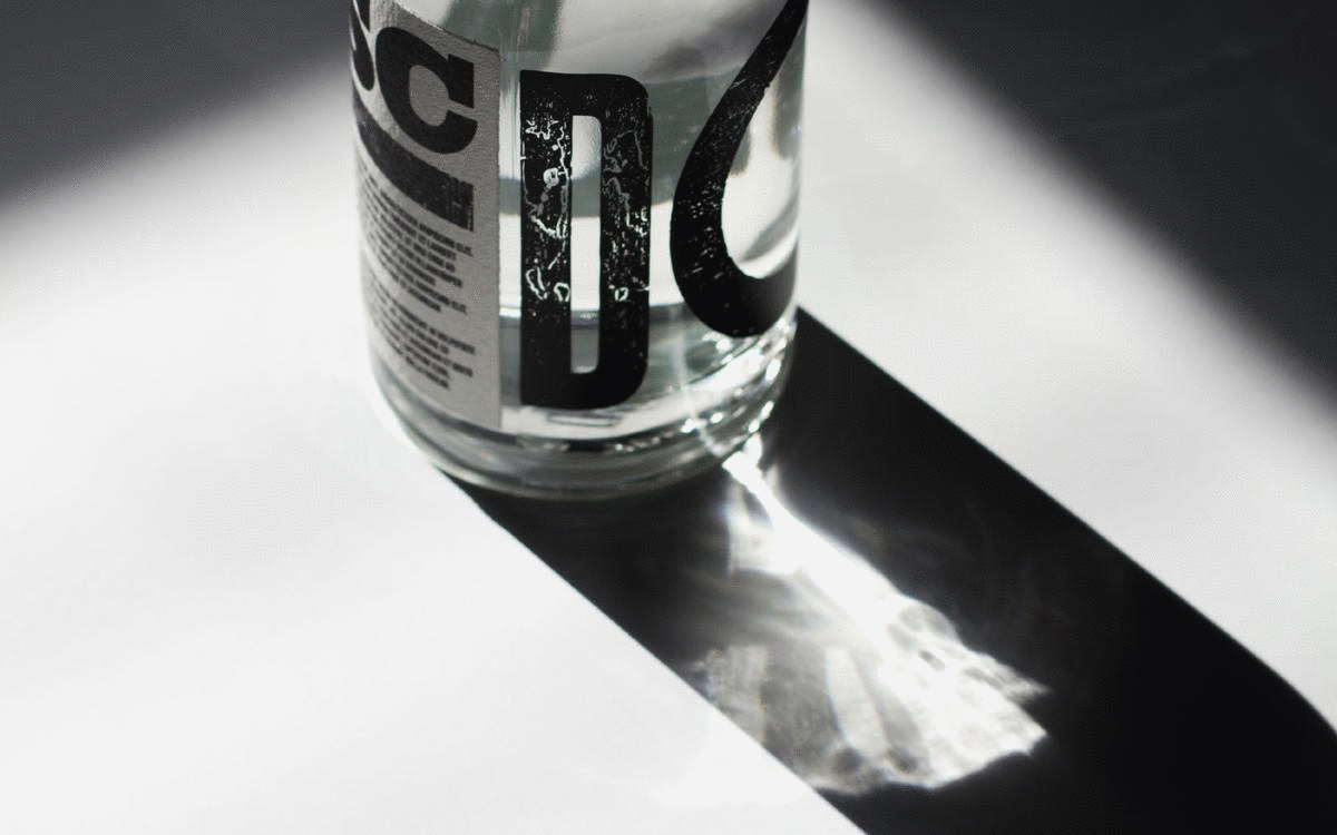
Using traditional woodblock letterpress process, each character of the SC DOGS brand marque has a unique texture and beautiful patina finish.
Weathered by centuries of island life.
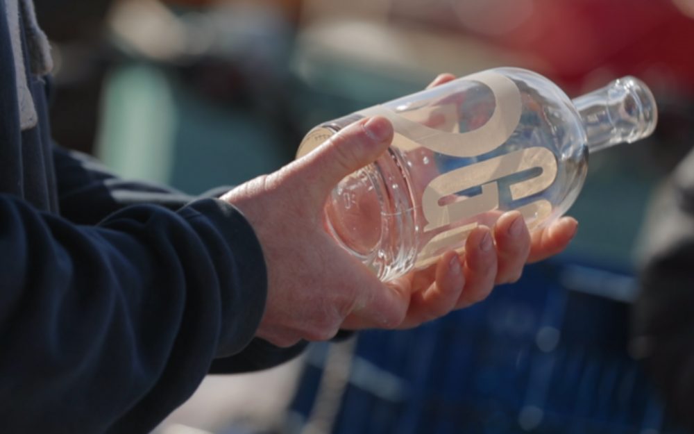
360 degree bottle design with character reveal
Ceramic screen print bottle sample
The bottle is designed with no set orientation. Ceramic screen printed lettering and a double sided label work together to create the ‘SC DOGS’ brand marque, whilst framing a character portrait through the port-hole.
In-house prototype
Distilled, aged and bottled on St. Martin’s, Isles of Scilly
Each bottle is dedicated to one of the islands’ own sea dogs. Distilling their stories and celebrating the people & spirit of St. Martin’s, Isles of Scilly.
SC Dogs is a range of delicately balanced premium rums and vodkas with a clean, rounded finish and a tang of the sea.
In response to the Covid-19 pandemic, the SC Dogs distillery switched it’s production from rum to hand sanitiser to supply and protect residents across the isles.
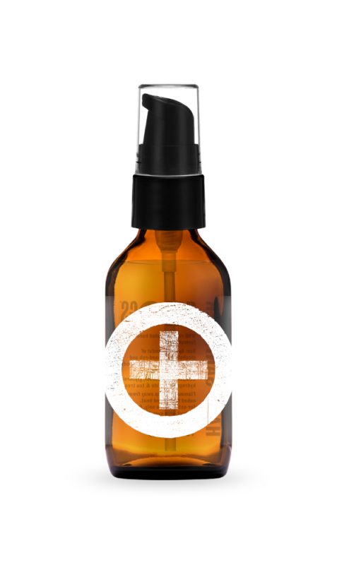
Hand sanitiser